# Load libraries
library(broom)
library(car)
library(corrr)
library(tidyverse)
library(patchwork)

# Import data
contraception = read_csv(file = "https://raw.githubusercontent.com/zief0002/redesigned-adventure/main/data/contraception.csv")

# View data
contraception📝 Regression Diagnostics
Identifying Extreme Observations
In this set of notes, we will give a brief introduction to empirical diagnostics to detect extreme observations. We will use the contraception.csv data to evaluate the effect of female education level on contraception rates.
A script file for the analyses in these notes is also available:
Effect of Female Education Level
To evaluate the effect of female education level on contraception rates, we need to fit a model that includes that effect. Since we know that a country’s wealth also has an impact on contraception rates, we also want to include that effect, which is measured by GNI, in the model.
# Create dummy variable for GNI indicator and single letter variable
contraception = contraception |>
  mutate(
    high_gni = if_else(gni == "High", 1, 0),
    gni2 = str_sub(contraception$gni, start = 1L, end = 1L)
  )
We will then examine a scatterplot of the data to determine whether we should fit a main effects or interaction model.
ggplot(data = contraception, aes(x = educ_female, y = contraceptive, color = gni2)) +
  geom_text(aes(label = gni2)) +
  geom_smooth(method = "lm", se = FALSE) +
  theme_bw() +
  xlab("Female education level") +
  ylab("Contraceptive rate") +
  ggsci::scale_color_d3() +
  guides(color = "none")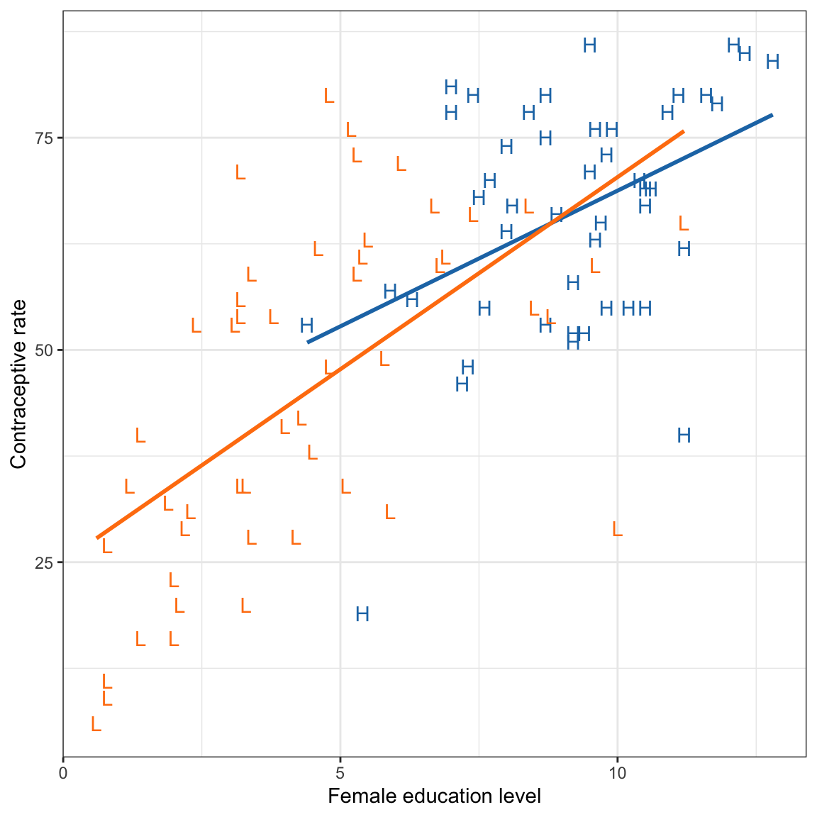
This plot suggests that the effect of female education level may differ for low and high wealth countries. This suggests that we may want to fit an intewraction model.
# Fit interaction model
lm.1 = lm(contraceptive ~ 1 + educ_female + high_gni + educ_female:high_gni, data = contraception)

# Model-level information
glance(lm.1)
# Coefficient-level information
tidy(lm.1, conf.int = 0.95)The model explains 49.7% of the variation in contraception rates, \(F(3, 97) = 30.6\), \(p<.001\). Examining the coefficient-level output, the interaction term is not statistically significant, \(p=0.341\), indicating that there may not be an interaction between female education level and wealth on contraception.
# Augment model
out_1 = augment(lm.1)

# View augmented data
out_1
# Residual Plots
p1 = ggplot(data = out_1, aes(x = .resid)) +
educate::stat_density_confidence(model = "normal") +
geom_density() +
theme_bw() +
xlab("Residuals")
p2 = ggplot(data = out_1, aes(x = .fitted, y = .resid)) +
geom_point() +
geom_smooth(method = "lm", se = TRUE) +
geom_smooth(method = "loess", se = FALSE) +
theme_bw() +
xlab("Fitted values") +
ylab("Residuals")
# Layout
p1 | p2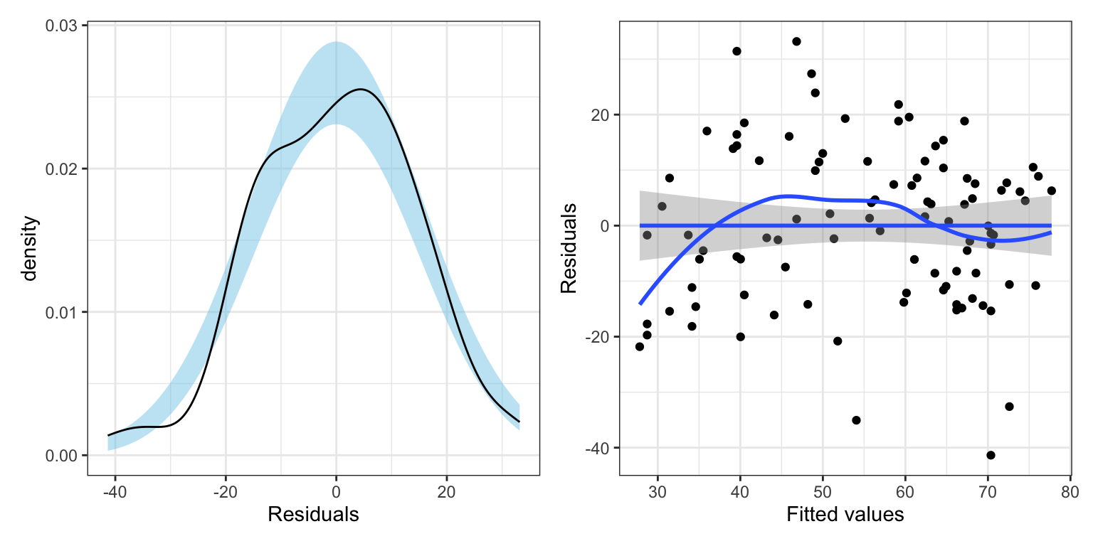
The model’s residuals do not seem to be consistent with the assumption of normality. Moreover, the assumption of homoskedasticity also seems to be violated, with the plot of the residuals versus the fitted values indicating increased variation in the residuals at higher fitted values. One question is whether the assumption violation is due to one or more extreme observations. For example, the three observations (54.1, -35.1), (70.4, -41.4) and (72.6, -32.6) all have extreme negative residuals. There are also a couple of observations that may have extreme positive residuals.
Identifying Extreme Observations
In a regression analysis, there are several ways in which an observation may be extreme. The figure below shows three different ways in which an observation may be extreme.
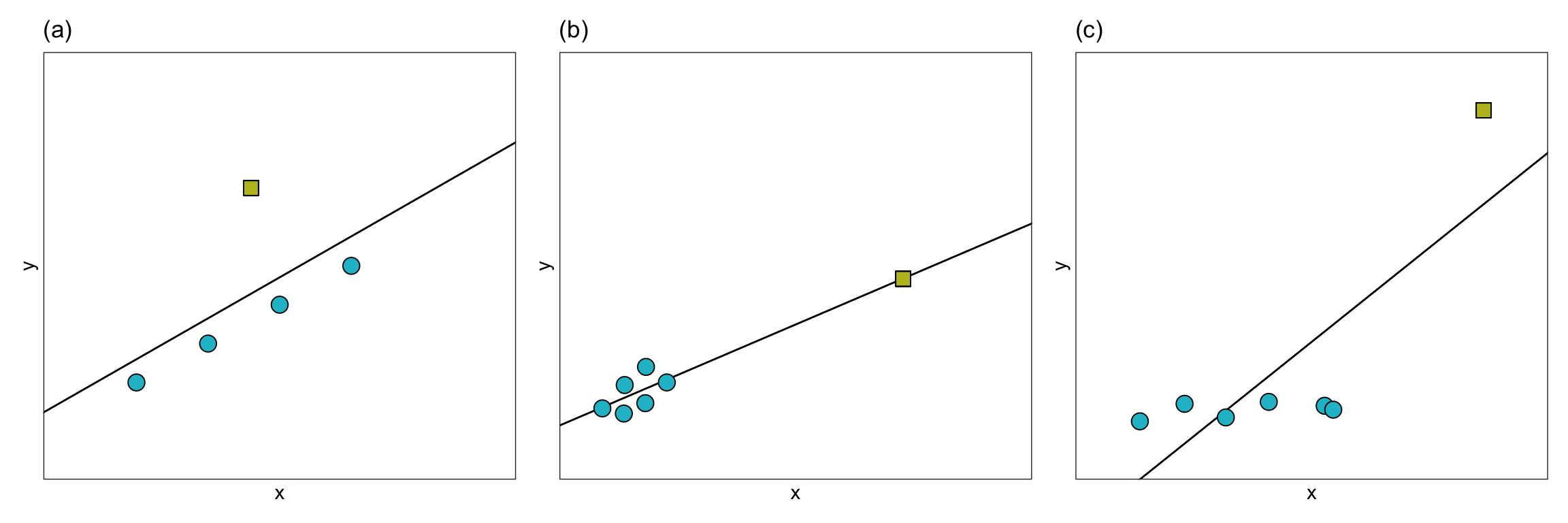
In Panel (a), the extreme observation has a large residual, but it’s x-value is similar to the x-values of the other observations. In Panel (b), the extreme observation has a large x-value relative to the other observations’ x-values, but it does not have a large residual. In Panel (c), the extreme observation has both a large x-value relative to the other observations’ x-values, and a large residual.
When an observation has a large residual relative to the other observations we call it a regression outlier. That is, a regression outlier has an unusual outcome value given its predictor values. As such, we might identify the extreme observation in Panels (a) and (c) as regression outliers, while the extreme observations in Panel (b) would likely not be identified as a regression outlier. We identify extreme observations in the x-direction as having high leverage. Leverage is simply a measure of how far away an observation is from from the mean value in the predictor space. So the extreme observations in Panels (b) and (c) would have high leverage, whereas the extreme observation in Panel (a) would have low leverage.
With extreme observations, we worry about whether the regression coefficients, and thus the line, will be impacted. You can see how the regression line changes for each of these three types of extreme observation in the plot below.
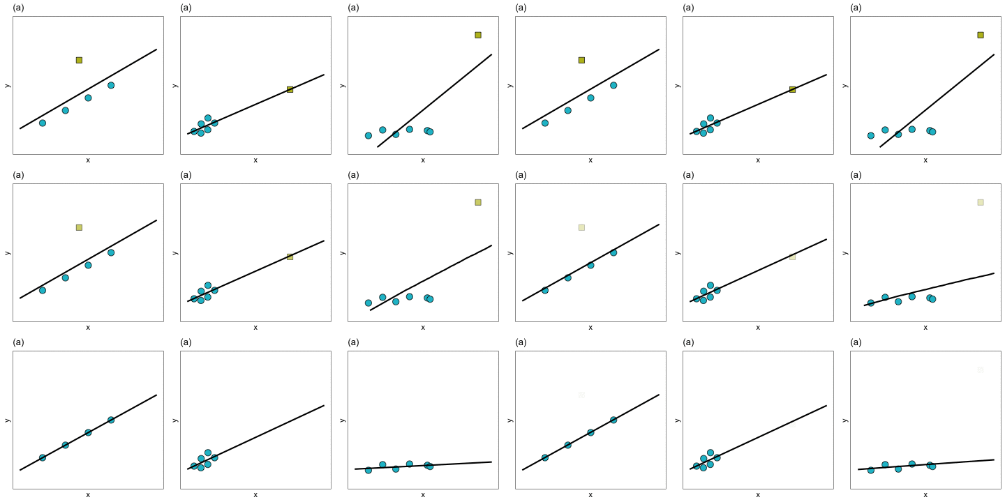
In Panels (a) and (b) removing the extreme observation did not have much of an effect on the regression line. In contrast, removing the extreme observation from Panel (c) resulted in a big change in the regression line. We would say that the extreme observation in Panel (c) is an influential observation—it influenced the location of the regression line (i.e., it influenced the coefficients). The extreme observations in Panels (a) and (b), on the other hand, are not influential observations. Importantly, observations can be extreme without impacting the regression coefficients. It is the influential observations that are problematic, since they can have a large impact on understanding the effects of the different predictors.
| Panel | Regression Outlier | Leverage | Influential |
|---|---|---|---|
| (a) | Yes | Low | No |
| (b) | No | High | No |
| (c) | Yes | High | Yes |
From this table, we can see that it is the combination of leverage with being a regression outlier that produces influence on the regression coefficients. Heuristically,
\[ \mathrm{Influence} = \mathrm{Leverage} \times \mathrm{Outlyingness} \]
In the next sections, we will look at different measures used by statisticians and applied scientists to quantify these properties for the observations in a data set.
Measuring Leverage
Leverage is simply a measure of how far away an observation is from from the mean value in the predictor space.1 To measure the leverage of an observation, we compute $h_{ii}, which is referred to as a hat-value. The hat-values are the diagonal elements of the H matrix where,
\[ \mathbf{H} = \mathbf{X}(\mathbf{X}^\intercal\mathbf{X})^{-1}\mathbf{X}^\intercal \]
Recall that this matrix was referred to as the hat-matrix since we could express the predicted values (\(\hat{y}_i\)) as a function of the hat-matrix, namely,
\[ \hat{\mathbf{Y}} = \mathbf{HY} \]
Writing this out,
\[ \begin{bmatrix} \hat{y}_1 \\ \hat{y}_2 \\\hat{y}_3 \\ \vdots \\ \hat{y}_n \end{bmatrix} = \begin{bmatrix} \hat{h}_{11} & \hat{h}_{12} & \hat{h}_{13} & \ldots & \hat{h}_{1n}\\ \hat{h}_{21} & \hat{h}_{22} & \hat{h}_{23} & \ldots & \hat{h}_{2n} \\ \hat{h}_{31} & \hat{h}_{32} & \hat{h}_{33} & \ldots & \hat{h}_{3n} \\ \vdots \\ \hat{h}_{n1} & \hat{h}_{n2} & \hat{h}_{n3} & \ldots & \hat{h}_{nn} \end{bmatrix} \begin{bmatrix} y_1 \\ y_2 \\ y_3 \\ \vdots \\ y_n \end{bmatrix} \]
This means we can compute the fitted value for the ith observation, \(\hat{y}_i\), as:
\[ \hat{y}_i = h_{i1}(y_1) + h_{i2}(y_2) + h_{i3}(y_3) + \ldots + h_{in}(y_n) \]
Each fitted value is a weighted combination of the outcome values, where the weights are the \(h_{ij}\) values. That is, the weight is a measure of how much each outcome value is contributing to the fitted value. For example if \(h_{ij}\) is large, it would indicate that \(y_i\) has a large impact on the value of \(\hat{y}_i\). It turns out that mathematically,
\[ h_{ii} = \sum_{j=1}^n h_{ij}^2 \]
That is, the values on the diagonal of the hat-matrix (the hat-values) are a summary of the contribution of all the outcome values on \(y_i\). Because of this, we can use \(h_{ii}\) as a measure of leverage for the ith observation. Below, we the data from the observations used in the earlier Panel (b) to compute leverage values.
# Create X-matrix
X = matrix(
  data = c(rep(1, 7), 1, 2.0, 2.04, 3.0, 3.03, 4, 15),
  nrow = 7
)

# Compute and view H-matrix
H = X %*% solve(t(X) %*% X) %*% t(X)
H
[,1] [,2] [,3] [,4] [,5] [,6]
[1,] 0.2209034 0.19722229 0.19627505 0.17354115 0.17283071 0.1498600
[2,] 0.1972223 0.18072658 0.18006675 0.16423087 0.16373600 0.1477352
[3,] 0.1962750 0.18006675 0.17941842 0.16385846 0.16337221 0.1476502
[4,] 0.1735411 0.16423087 0.16385846 0.15492060 0.15464129 0.1456103
[5,] 0.1728307 0.16373600 0.16337221 0.15464129 0.15436845 0.1455466
[6,] 0.1498600 0.14773516 0.14765017 0.14561032 0.14554658 0.1434855
[7,] -0.1106326 -0.03371767 -0.03064107 0.04319731 0.04550476 0.1201123
[,7]
[1,] -0.11063264
[2,] -0.03371767
[3,] -0.03064107
[4,] 0.04319731
[5,] 0.04550476
[6,] 0.12011229
[7,] 0.96617702# Show that h_ii = sum(h_ij^2)
# Compute sum of all the squared values in row 1
sum(H[1, 1:7] ^ 2)[1] 0.2209034# Find the h_ii element in row 1
H[1, 1][1] 0.2209034# Extract the hat-values
diag(H)[1] 0.2209034 0.1807266 0.1794184 0.1549206 0.1543684 0.1434855 0.9661770From these values we can see that the first six observations have pretty similar hat-values while the 7th observation (the extreme observation) has a large hat value compared to the others. This is reasonably easy to see when there are only seven observations, but becomes difficult to identify when looking at the hat-values in larger data sets. One tool for identifying large hat-values is to create an index plot of the leverage values. An index plot simply graphs some measure (in this case the hat-values) versus the case value of each observation. Below is the syntax and resulting index plot of the hat-values.
# Create data to plot from
d = data.frame(
  case = 1:7,
  h_ii = diag(H)
)

# View d
d
Index plot of the leverage values for the 7 cases displayed in Panel (b).
# Create index plot
ggplot(data = d, aes(x = case, y = h_ii)) +
  geom_point(size = 4) +
  theme_bw() +
  xlab("Observation number") +
  ylab("Leverage value")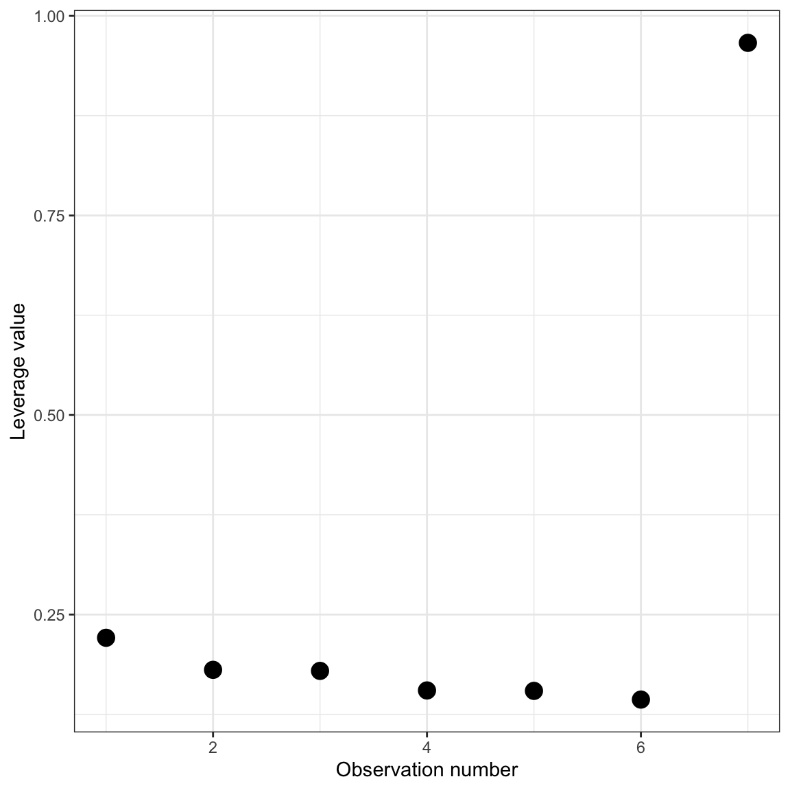
From this plot, it is easy to spot unusually high leverage values.
Identifying High Leverage Observations in the Contraception Example
In practice, we can use the augment() function from the {broom} package to obtain the leverage values for each observation for a fitted model. These values are provided in the .hat column. Previously, we had assigned the augment output for lm.1 to an object called out_1.
# View augmented data
out_1
Here, for example, we can see that the leverage value for the first observation is 0.0875. To determine which observations have high leverage, we will create an index plot of the leverage values.
# Add case number to the augmented data
out_1 = out_1 |>
  mutate(
    case = row_number()
    )

# View augmented data
out_1
# Create index plot
ggplot(data = out_1, aes(x = case, y = .hat)) +
geom_point(size = 4) +
theme_bw() +
xlab("Observation number") +
ylab("Leverage value")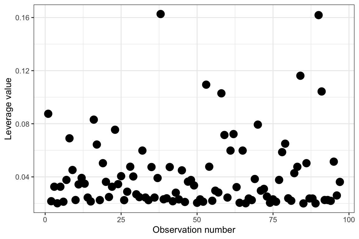
While it seems we may be able to identify observations with high leverage in this plot, sometimes this can be difficult depending on the data. For example, the two highest observations seem like they probably have high leverage relative to the others, but what about the four observations with leverage values between 0.10 and 0.12?
One criterion that applied researchers use is that an observation has high leverage if:
\[ h_{ii} > \frac{2p}{n} \]
where p is the trace of H, which also happens to be the sum of the \(h_{ii}\) values. This implies that,
\[ \begin{split} h_{ii} &> \frac{2p}{n} \\[1em] &> \frac{2\sum h_{ii}}{n} \\[1em] &> 2 \bar{h} \end{split} \]
where \(\bar{h}\) is the average leverage value. Thus, we are identifying observations with a leverage value greater than twice the average value, and those are the observations we are saying have high leverage. It is often useful to draw a horizontal line in the index plot at this value. Below we add in this line, and also plot the observations’ case value rather than plotting points. This helps us identify the cases with high leverage.
# Compute cutoff
cutoff = 2 * mean(out_1$.hat)
cutoff
[1] 0.08247423# Create index plot
ggplot(data = out_1, aes(x = case, y = .hat)) +
geom_text(aes(label = case)) +
geom_hline(yintercept = cutoff, color = "#cc79a7") +
theme_bw() +
xlab("Observation number") +
ylab("Leverage value")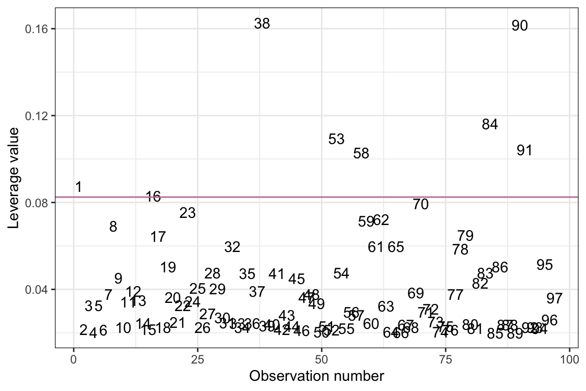
Based on this criterion, there are several observations that have high leverage values in this model. Since these observations represent countries, and we have country names in the original data, we could also create this index plot using country names to label the observations instead of case numbers.
# Add country names to augmented data
out_1 = out_1 |>
  mutate(
    country = contraception$country
  )

# View data
out_1
Index plot of the leverage values from Model 1. Observations are identified by their country name. The reddish-purple line demarcates observations with a leverage value greater than two times the average leverage value.
# Create index plot
ggplot(data = out_1, aes(x = case, y = .hat)) +
  geom_text(aes(label = country)) +
  geom_hline(yintercept = cutoff, color = "#cc79a7") +
  theme_bw() +
  xlab("Observation number") +
  ylab("Leverage value")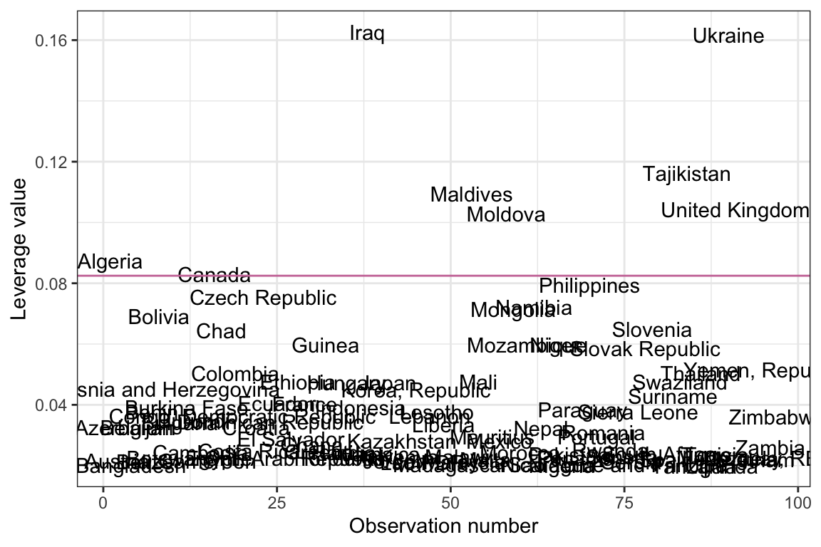
Measuring Outlyingness
A regression outlier is an observation that has an unusual outcome value given its predictor values; that is, it has a large residual in the regression model. The residuals for each observation are provided in the .resid column of the augment() output. Unfortunately, because the residuals are in the same metric as the outcome variable (in our case contraception rates), it can be hard to judge what “large” is. One suggestion is to standardize the residuals so we can better evaluate which observations have large residuals.
To standardize a residual, we divide each residual by its standard error (SE), where the SE of a residual is computed as:
\[ \mathrm{SE}(e_i) = \sqrt{s^2_e (1 - h_{ii})} \] and \(s^2_e\) is the error variance estimated by the model and \(h_{ii}\) is the ith observation’s leverage value. Then, the standardized residual2 for the ith observation is simply,
\[
e^*_i = \frac{e_i}{\sqrt{s^2_e (1 - h_{ii})}}
\] To compute these values for the fitted contraception model, we obtain the estimated error variance by squaring the sigma value from the glance() output. Then we can compute the standardized residuals using the information in the augment() output.
# Obtain estimate of error variance
s2e = glance(lm.1)$sigma ^ 2
s2e
[1] 207.4887# Compute standardized residuals
out_1 |>
mutate(
standardized_resid = .resid / (sqrt(s2e * (1 - .hat)))
)Notice that these values are the same as those in the .std.resid column which is created from the augment() function. To evaluate which observations have a large standardized residual (and thus a large residual), we can create a plot of the standardized residuals versus the fitted values similar to that we created earlier to evaluate the model assumptions.
Since one of the assumptions of the regression model is that the residuals are normally distributed, we can make use of the empirical rule (which indicates that 95% of the residuals should be within two standard errors of the mean residual of zero) to identify observations with “high” values. Using this heuristic, we would say that an observation that has a standardized residual more than 2 SEs from zero is a regression outlier.3 Below we create the index plot of the standardized residuals, and add guides at \(\pm2\) SEs.
# Create plot of standardized residuals versus
ggplot(data = out_1, aes(x = .fitted, y = .std.resid)) +
  geom_text(aes(label = country)) +
  geom_hline(yintercept = 0) +
  geom_hline(yintercept = c(-2, 2), color = "#cc79a7") +
  theme_bw() +
  xlab("Fitted values") +
  ylab("Residuals")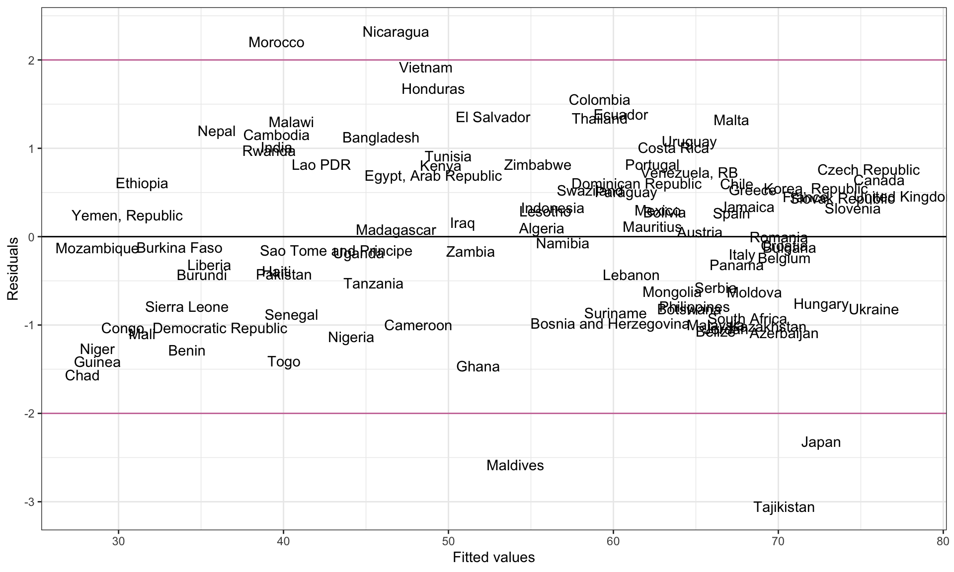
Statistical Test for Identifying Observations with Large Residuals
Some educational scientists evaluate whether a particular observation is a regression outlier, by using a hypothesis test to determine whether its residual differs statistically from 0. To do this, we can use a t-test where we evaluate the standardized residual,
\[ e^*_i = \frac{e_i}{\mathrm{SE}(e_i)} \]
This is evaluated in a t-distribution with df equivalent to the residual degrees-of-freedom from the model. The t-value here looks a lot like the formula we used to compute the standardized residual.
Unfortunately, we cannot use the standardized residual here since, if we do, the numerator and denominator are not independent (the term \(s^2_e\) in the denominator is a function of \(e_i\).). This would mean that the resulting statistic is not t-distributed. To fix this problem, we can compute an estimate of \(s^2_e\) that is computed based on the regression deleting the ith observation. That is,
\[ t_i = \frac{e_i}{\sqrt{s^2_{e(-i)} (1 - h_{ii})}} \] To differentiate this change in the standard error, sometimes statisticians refer to this value as a studentized residual rather than a standardized residual.4
Computing the Studentized Residual
All of the components to compute the stuentized residuals are provided in the augment() output.
# View augmented output
out_1
The values in the .sigma column are estimates of \(s_e\) computed based on the regression deleting the ith observation. That is, they are \(s_{e(-i)}\). To compute the studentized residual for Observation 1,
\[
\begin{split}
t_1 &= \frac{e_i}{s_{e(-i)}\sqrt{(1 - h_{ii})}} \\[1em]
&= \frac{1.34}{14.5\sqrt{1 - .0875}} \\[1em]
&= 0.09674318
\end{split}
\] We can also use this formula to compute the studentized residual for each observation in the augmented() output.
# Compute studentized residuals
out_1 = out_1 |>
  mutate(
    t_i = .resid / (.sigma * sqrt(1 - .hat))
  )

# View output
out_1
Alternatively, we can also use the rstudent() function to compute the studentized residuals directly. This function takes the model object as its input.
# Compute studentized residuals
out_1 = out_1 |>
  mutate(
    t_i = rstudent(lm.1)
  )

# View output
out_1
Testing Observations for Outlyingness
Now that we have the t-value for each of the residuals, we can evaluate each residual for outlyingness by evaluating each t-statistics in the t-distribution with df equivalent to the residual degrees-of-freedom from the model. In our case,
\[ \mathit{df} = 93 \] Thus, to evaluate whethe the first observation is a regression outlier, we would evaluate
\[ t(93) = 0.097 \] to determine if the residual is statistically different than 0. Below, we compute the p-value associated with the first observation.
# Compute p-value for Obs. 1
2 * pt(-0.097, df = 93)
[1] 0.9229351Because we need to carry out this test for each of the 97 observations, we need to adjust each p-value based on the number of comparisons. This is typically done by using a Bonferroni adjustment.
# Bonferroni adjustment for Obs. 1
0.9229351 * 97
[1] 89.5247Since this results in a value greater than 1, and p-values need to be between 0 and 1, we report this p-value as 1. Since this is not statistically significant (at the \(\alpha = 0.05\) level), Observation 1 is not considered a regression outlier. Below is the syntax I use to compute the Bonferroni adjusted p-values for each of the 97 observations.
# Bonferroni adjustment for all observations
out_1 = out_1 |>
  mutate(
    p = 2 * pt(-abs(t_i), df = 97),
    p_adj = p.adjust(p, method = "bonferroni")
  )

# Order data by adjusted p-values
arrange(out_1, p_adj)
These results indicate that none of the observations are more extreme than would be expected given the sample size. In other words, the test would not identify any observations as regression outliers.
Measuring Influence
Recall that an influential observation is an observation that has a large impact on the values of the regression coefficients. There have been several methods proposed to measure influence. Here we will look at a few of those methods.
DFBETAS
The most direct way to measure the influence of an observation is to drop that observation from the dataset and measure the difference in regression coefficients. We can define this difference as \(d_{ij}\) (the difference between the jth regression coefficient when the ith observation is dropped) as:
\[ d_{ij} = \hat{\beta}_j - \hat{\beta}_{j(-i)} \]
These are referred to as DFBETAs following the naming convention set by Belsley, Kuh, & Welsch (1980). The dfbeta() function computes the DFBETA values for each coefficient for all observations. This function takes the fitted model object as its input. (Here we pipe this output into a data frame for better screen printing in the notes.)
dfbeta(lm.1) |>
  data.frame()
Positive DFBETA values indicate that removing the observation results in a lower regression coefficient value, while a negative DFBETA value would indicate that removing the observation results in a higher regression coefficient value. For example, focusing on the interaction term, we see that removing Observation 1 would result in a higher value on the interaction coefficient by .0299 units.
Because the DFBETA values are in the same unit as the coefficients, it can sometimes be difficult to assess whether those values are indicative of a small or large amount of influence. To remedy this, the DFBETA values are typically scaled. To do this, the DFBETA value is divided by a scaled RMSE estimate,
\[ d^*_{ij} = \frac{d_{ij}}{s_{e(-i)}\sqrt{c_{jj}}} \]
where \(s_{e(-i)}\) is the RMSE estimate when the ith observation is deleted from the model, and \(c_{jj}\) is the jth diagonal element of the \((\mathbf{XX}^\intercal)^{-1}\) matrix corresponding to the appropriate regression coefficient. For example, here we compute the \((\mathbf{XX}^\intercal)^{-1}\) matrix for the fitted model.
X = model.matrix(lm.1)
solve(t(X) %*% X)
(Intercept) educ_female high_gni educ_female:high_gni
(Intercept) 0.07946790 -0.013509292 -0.07946790 0.013509292
educ_female -0.01350929 0.003068899 0.01350929 -0.003068899
high_gni -0.07946790 0.013509292 0.62476222 -0.070745716
educ_female:high_gni 0.01350929 -0.003068899 -0.07074572 0.009320611The \(c_{jj}\) value corresponding to the interaction term is 0.009320611.
Again, using the .sigma value from the augmented output to obtain \(s_{e(-i)}\), we can compute the scaled DFBETA value for the interaction term based on the first observation as:
#Compute scaled DFBETA for interaction term (Obs. 1)
-0.0299422430 / (14.5 * sqrt(0.009320611))
[1] -0.02138918Removing Observation 1 would result in a higher value on the interaction coefficient by .0214 standard deviation units. We can use the dfbetas() function to compute all the scaled DFBETA values. (Here we pipe this output into a data frame for better screen printing in the notes.)
# Get scaled DFBETA values
dfbetas(lm.1) |>
  data.frame()
As with our other measures, it is useful to create an index plot of the scaled DFBETA values. Typically you would create separate index plots for each of the coefficients. Below, I include the scaled DFBETA values in a data frame, and create the index plots. Because we are interested in large scaled DFBETA values regardless of sign, I plot the absolute value of the scaled DFBETA values in each case plot. Here I focus on the index plot associated with the interaction term since that is the primary effect of interests in an interaction model.
# Set up data with case number and scaled DFBETA values
scl_dfbeta = data.frame(
  case = 1:97
) |>
  cbind(dfbetas(lm.1))


# Create index plots
ggplot(data = scl_dfbeta, aes(x = case, y = abs(`educ_female:high_gni`))) +
  geom_text(aes(label = case), size = 3) +
  xlab("Observation number") +
  ylab("Scaled DFBETA value") +
  theme_bw() +
  geom_hline(yintercept = 2 / sqrt(97), color = "#cc79a7")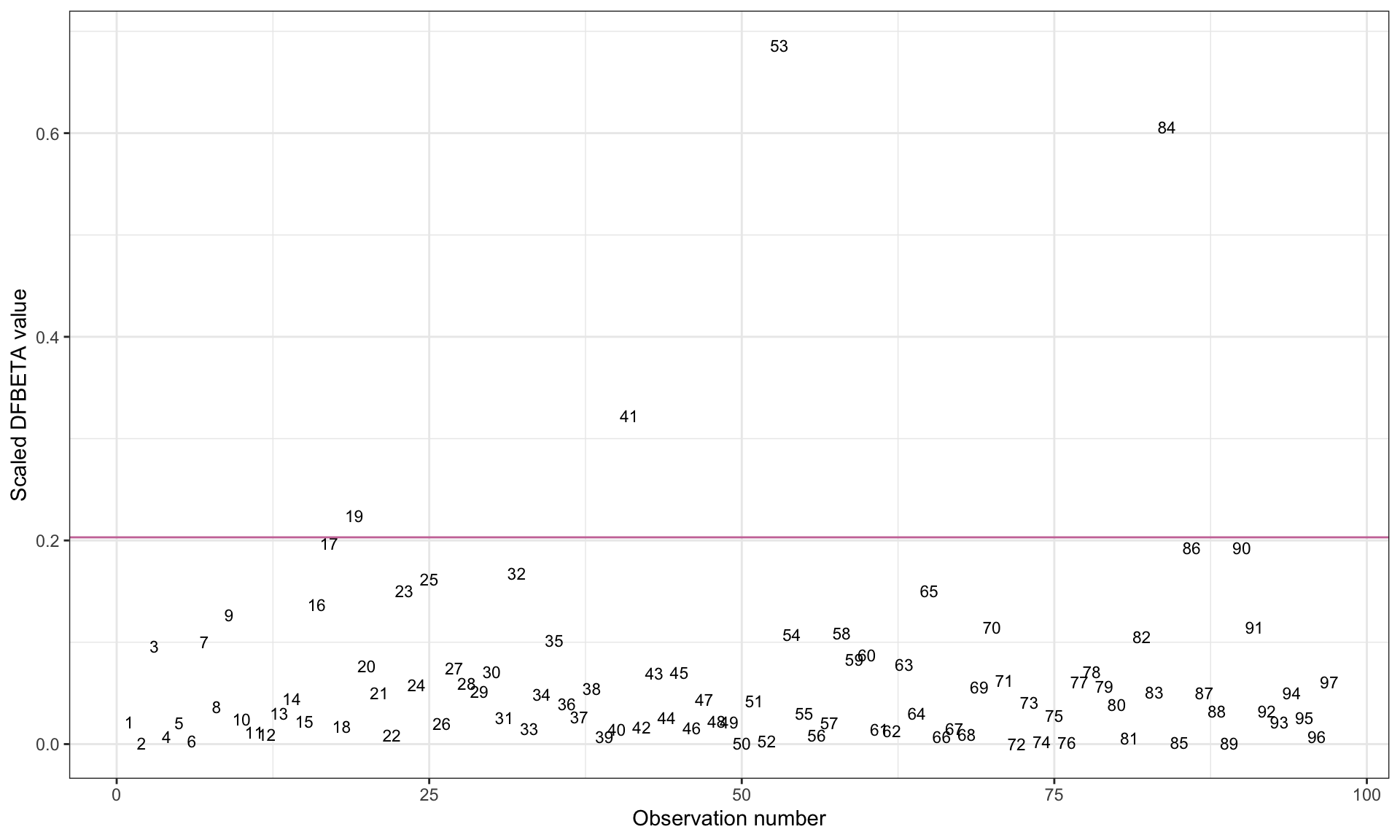
Note that because the variable name included a colon (which is a special character in R syntax), we had to enclose the variable name educ_female:high_gni in back ticks in the ggplot() syntax. We also add a guideline to demarcate observations where \(\vert d^*_{ij}\vert > \frac{2}{\sqrt{n}}\).
We want to use the plot to identify cases that have an absolute scaled DFBETA value that is substantially higher than most other observations’ absolute scaled DFBETA values. (The guideline can help us identify these cases.) Observations 53 (Maldives), 84 (Tajikistan), and 41 (Japan) seem to have influence on the interaction coefficient of interest. Observation 19 (Colombia) also may have a modest amount of influence on the interaction term.
Cook’s Distance
While the DFBETA and scaled DFBETA values directly measure the impact of an observation on each of the coefficients, these measures of influence are not commonly used in practice. Instead, Cook’s Distance (Cook, 1977) is a more commonly used measure of influence by applied researchers. This measure is computed as:
\[ D_i = \frac{(e^*_i)^2}{p + 1} \times \frac{h_{ii}}{1 - h_{ii}} \]
where \(e^*_i\) is the standardized residual for the ith observation, p is the number of predictors in the fitted model, and \(h_{ii}\) is the leverage value for the ith observation. Below we compute Cook’s Distance for Observation 1 using values obtained from the augment() output.
# Compute D_i for Obs. 1
0.0976^2 / (3 + 1) * 0.0875 / (1 - 0.0875)
[1] 0.0002283573The Cook’s Distance values are also generated in the .cooksd column of the augment() output.
# View augmented output
out_1
Observations with a Cook’s Distance such that \(D_i > \frac{4}{n-p-1}\) are considered influential. In this case, Observation 1 would not be considered influential as its Cook’s Distance of 0.0002 is not larger than the cutoff of 0.043.
Unlike the DFBETA measures which computes multiple measures of influence for each observation, Cook’s Distance computes a single measure of influence for each observation. This measures the overall influence across all of the predictors rather than the influence on any one predictor. (It is probably for this reason that Cook’s Distance is favored by applied researchers.) We can, once again, create an index plot to plot the Cook’s Distance values. Within this plot, a guideline can be added to identify cases larger than the cutoff.
# Add case number to data
out_1 = out_1 |>
  mutate(case = row_number())

# Create index plot
ggplot(data = out_1, aes(x = case, y = .cooksd)) +
  geom_text(aes(label = case), size = 3) +
  xlab("Observation number") +
  ylab("Cook's D value") +
  theme_bw() +
  geom_hline(yintercept = 4 / (97 - 3- 1), color = "#cc79a7")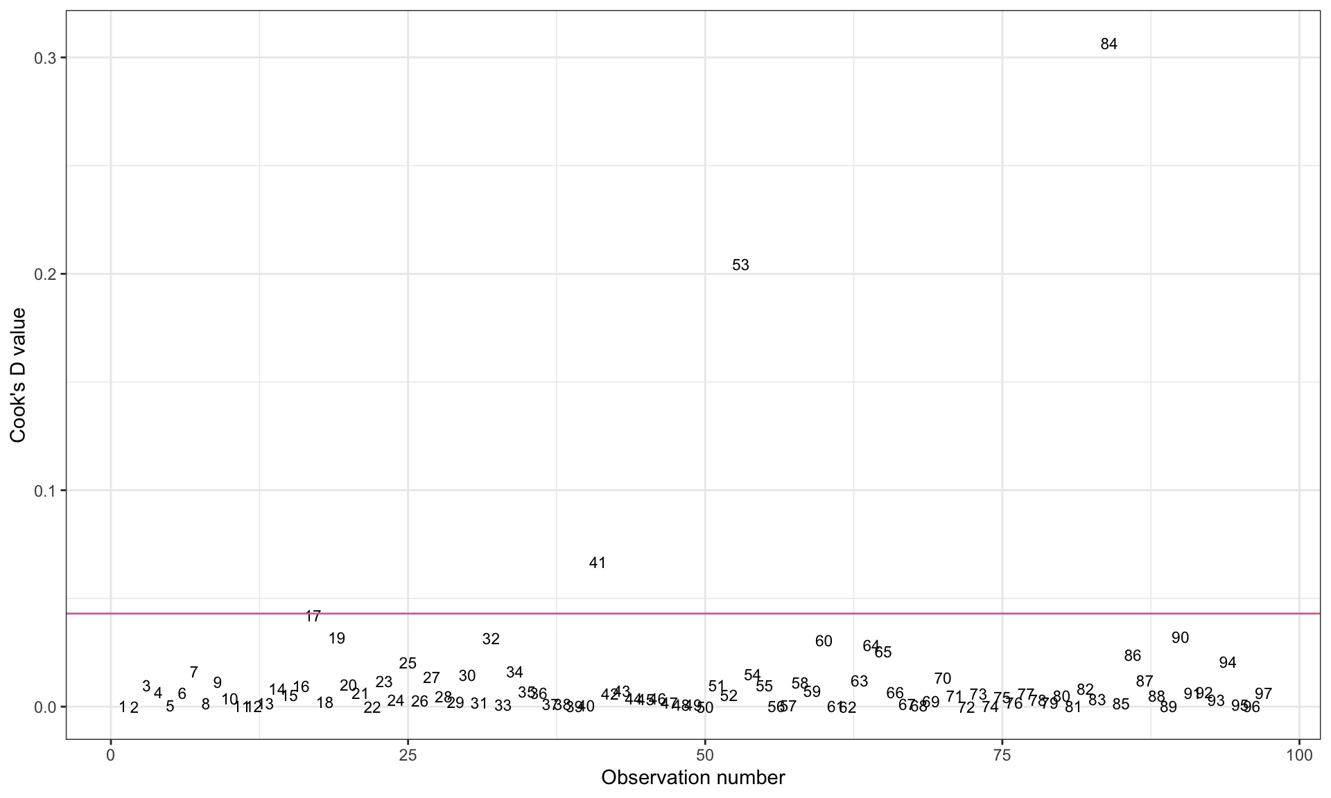
Based on the plot, we can identify Observations 84 (Tajikistan), 53 (Maldives), and 41 (Japan) as being influential in the model.
One Last Diagnostic Plot
It is possible to create a plot that includes the measures of leverage, outlyingness, and influence. To do this, we will create a scatterplot of outlyingness versus leverage. Then, we will map point size to the degree of influence.
# Create index plot
ggplot(data = out_1, aes(x = .hat, y = abs(t_i))) +
  geom_text(aes(label = case, size = .cooksd)) +
  xlab("Leverage value") +
  ylab("Absolute studentized residual") +
  theme_bw() +
  scale_size(
    name = "Cook's D",
    range = c(1, 10)
    ) +
  geom_hline(yintercept = 2, color = "#cc79a7", linetype = "dashed") +
  geom_vline(xintercept = 2 * mean(out_1$.hat), color = "#cc79a7", linetype = "dashed") +
  guides(size = "none")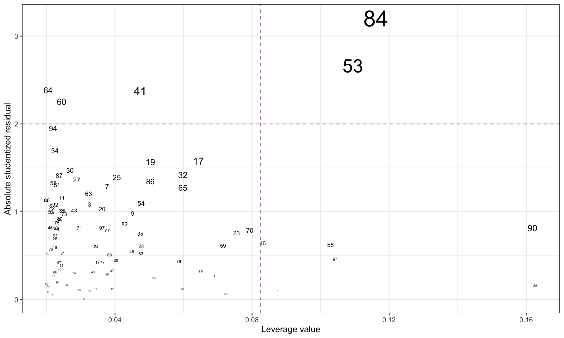
From this plot we can see that Observations 84 (Tajikistan) and 53 (Maldives) are observations that are identified as having high leverage and as potential regression outliers. Moreover, the large size of their text indicates a relatively large Cook’s D value, suggesting they may be influential.
Removing Observations
Based on our analyses, we have identified the following observations as being extreme on one or more of the diagnostic measures.
| Case | Country | High Leverage | Regression Outlier | Influential |
|---|---|---|---|---|
| 1 | Algeria | ✔ | ||
| 16 | Canada | ✔ | ||
| 38 | Iraq | ✔ | ||
| 41 | Japan | ✔ | ✔ | |
| 53 | Maldives | ✔ | ✔ | ✔ |
| 58 | Moldova | ✔ | ||
| 60 | Morocco | ✔ | ||
| 64 | Nicaragua | ✔ | ||
| 84 | Tajikistan | ✔ | ✔ | ✔ |
| 90 | Ukraine | ✔ | ||
| 91 | United Kingdom | ✔ |
Not only might these unusual observations impact the regression coefficients, but they also might lead to violations of the regression model’s assumptions. For example, having regression outliers might violate the assumption of homoskedasticity or normality. Once we have identified observations that are unusual or that influence the regression coefficients, should we remove them? This depends on why the observations are unusual. For example, do they belong to your population? If they don’t belong to your population of interest, then the observations can be removed. Otherwise, we need to consider other methods of dealing with them. For example,
- Sometimes, we can make observations less unusual by transforming the data (e.g., log-transformation). We will cover this in the next set of notes.
- Other times we have to use a more robust method of fitting the model (e.g., non-parametric regression).
Large samples are far more robust to unusual cases. In large samples, unusual cases rarely have much influence on the estimated coefficients or SEs.
In our example, it is unclear that we can remove Tajikistan and Maldives from the data. However, here we remove the observations and re-fit the interaction model purely for pedagogical purposes.
# Remove observations
contraception2 = contraception |>
  filter(!country %in% c("Tajikistan", "Maldives"))

# Fit interaction model
lm.2 = lm(contraceptive ~ 1 + educ_female + high_gni + educ_female:high_gni, data = contraception2)

# Augment model
out_2 = augment(lm.2)

# View augmented data
out_2
# Residual Plots
p1 = ggplot(data = out_2, aes(x = .resid)) +
educate::stat_density_confidence(model = "normal") +
geom_density() +
theme_bw() +
xlab("Residuals")
p2 = ggplot(data = out_2, aes(x = .fitted, y = .resid)) +
geom_point() +
geom_hline(yintercept = 0) +
theme_bw() +
xlab("Fitted values") +
ylab("Residuals")
# Layout
p1 | p2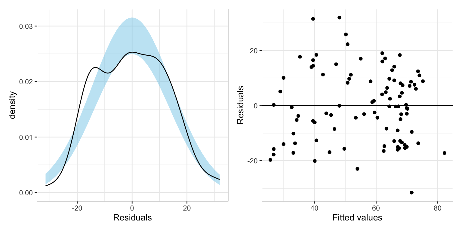
# Model-level information
glance(lm.2)
# Coefficient-level information
tidy(lm.2, conf.int = 0.95)By removing Takijistan and Maldives, the model \(R^2\) increased from 0.497 to 0.560. We expect this since both observations were potential regression outliers. By removing them, we reduced the residual variation getting better fit. (We can also see this in the size of the RMSE which decreased from 14.4 tp 13.3.)
At the coefficient-level, all of the effect sizes (the coefficient estimates) increased. In particular, we are interested in the interaction effect, which now has a bigger effect (it is more negative). Moreover, because we reduced the residual variation, the SEs on the effects have decreased. Higher estimates and smaller SEs lead to smaller p-values and more precise interval estimates.
However, we also note that in this new model, we might now have new unusual values.
# Add studentized residuals and country names
out_2 = out_2 |>
  mutate(
    t_i = .resid / (.sigma * sqrt(1 - .hat)),
    country = contraception2$country
  )


# Create index plot
ggplot(data = out_2, aes(x = .hat, y = abs(t_i))) +
  geom_text(aes(label = country, size = .cooksd)) +
  xlab("Leverage value") +
  ylab("Absolute studentized residual") +
  theme_bw() +
  scale_size(
    name = "Cook's D",
    range = c(1, 10)
    ) +
  geom_hline(yintercept = 2, color = "#cc79a7", linetype = "dashed") +
  geom_vline(xintercept = 2 * mean(out_2$.hat), color = "#cc79a7", linetype = "dashed") +
  guides(size = "none")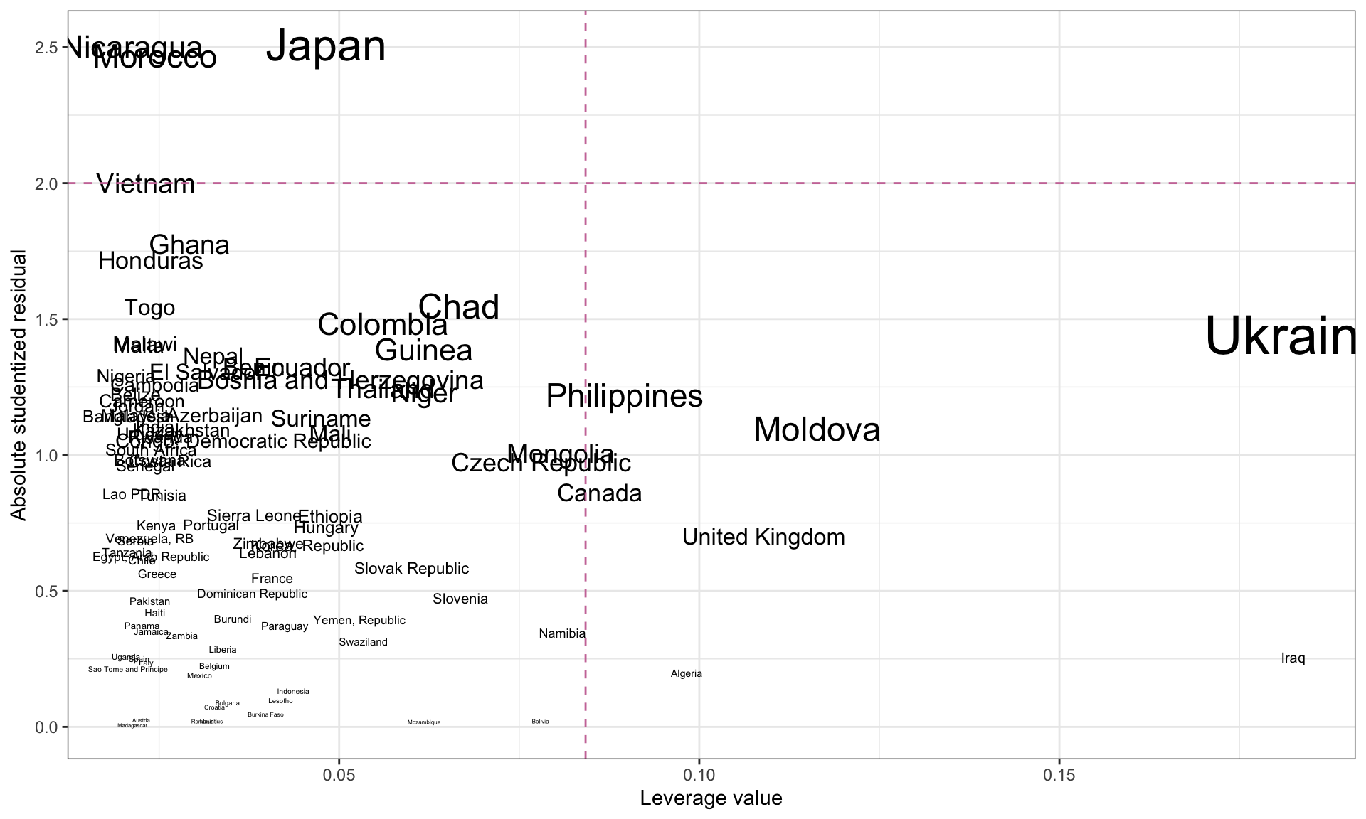
Here it looks like there are no new influential values.
References
Footnotes
When there is more than one predictor, leverage is measure of how far away an observation is from the centroid of the predictor space.↩︎
Because we are dividing by the standard error sometimes these are referred to as internally studentized residuals rather than standardized residuals.↩︎
If the sample size is large, it is better to use the heuristic that regression outliers have a standardized residual more than 3 SEs from zero.↩︎
Studentized residuals are also sometimes referred to as: deleted studentized residuals, externally studentized residuals, and in some books and papers, even as standardized residuals. Ugh.↩︎