ggplot(data = city, aes(x = education, y = income)) +
  geom_point() +
  xlab("Education level (in years)") +
  ylab("Annual income (in U.S. dollars)") +
theme_bw()Learning ggplot2 Worksheet
Directions
Work with one or more other students to complete each of the tasks in this document. As you work through these tasks, you may want to refer to the following:
As part of this, include the syntax you use to complete each tasks in a script file. As you write your script file, adhere to good coding practices:
- Include comments
- Include spaces
- Include a line break after every pipe operator you use.
You can check in with Andy or the TA at the completion of each task to check your work.
Task 1: Import Data
Import the riverview.csv data into an object named city. Also, examine the data codebook so you are familiar with the different attributes.
Task 2: Sketch
Make a rough sketch of the plot you think this syntax will produce. Try not to run the syntax until you create a sketch. After you have created your rough sketch, run the syntax to check your work.
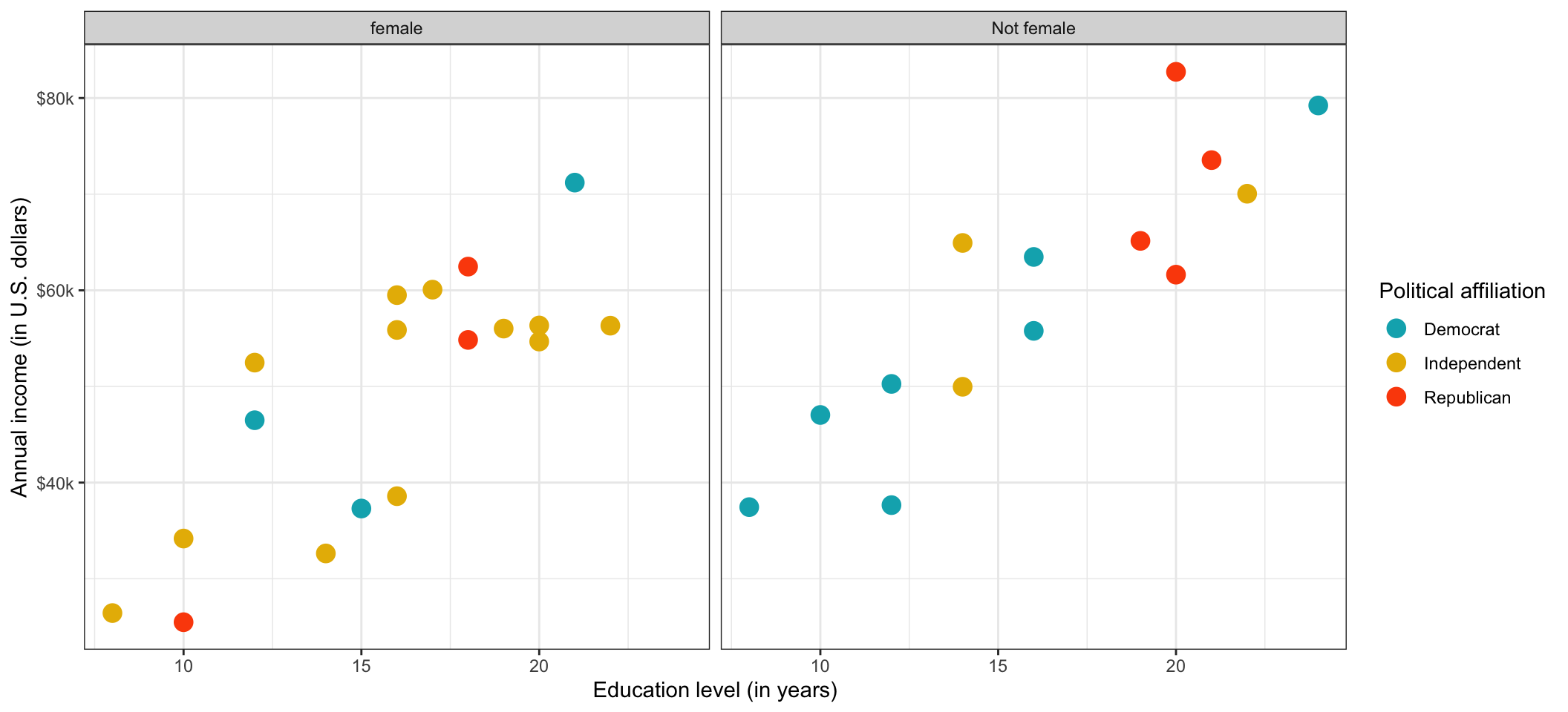
Task 3: Mimic a Plot
Write syntax to create the following plot, which was created using the city (riverview) data. Write this syntax in a script file. Be sure you are using good coding practices and putting each layer on a different line. (Hint: If you want to be exact, use Tin Eye Lab’s Color Extraction tool to extract the hex codes for the color.)

Task 4: Export a Plot and Import it into a Document
Export the plot you created in Task 3 as a PNG file. Be sure the aspect ratio of the plot is reasonable (the plot is not scrunched or stretched). Import the exported PNG file into a word-processed document. Re-size the plot so that it is not taking up excess space in the document, and also still readable. Add a figure number and caption to your plot.
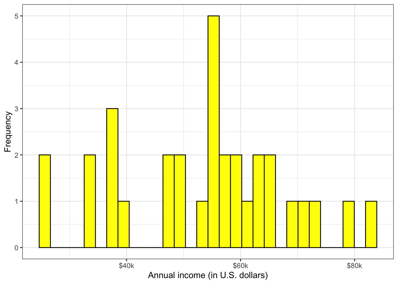
Task 5: Mimic a Plot
Write syntax to create the following plot, which was created using the city (riverview) data. Write this syntax in a script file. Be sure you are using good coding practices and putting each layer on a different line.

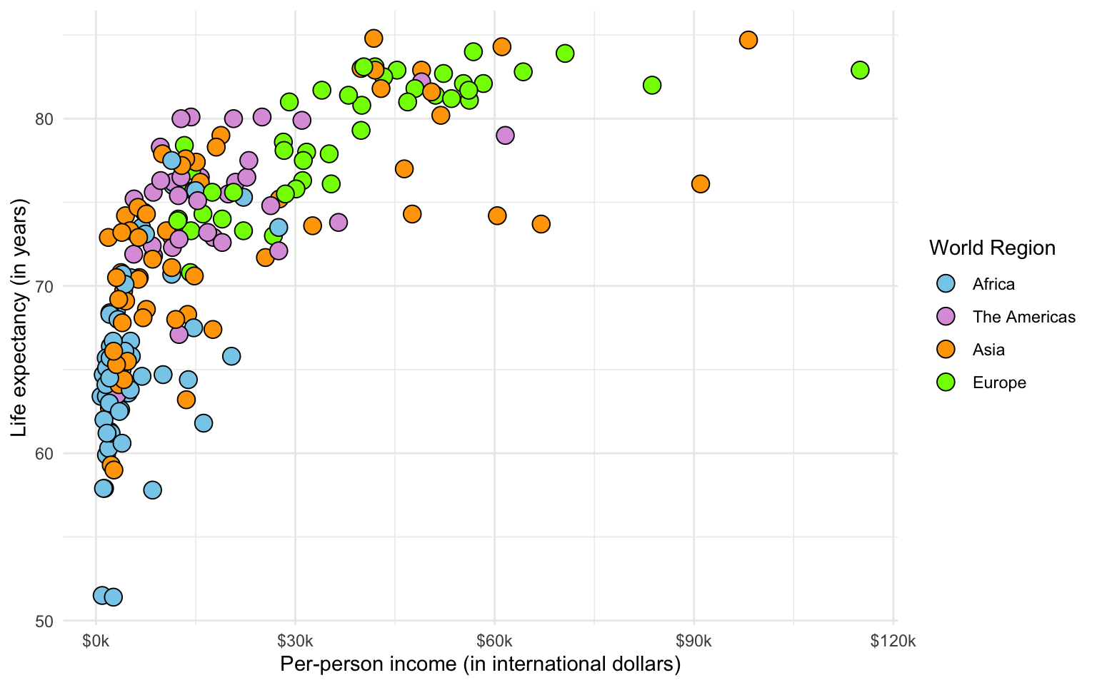
Task 6: Mimic a Plot
Write syntax to create the following plot, which was created using the gapminder.csv data. Write this syntax in a script file. Be sure you are using good coding practices and putting each layer on a different line.

Task 7: Add Text to Label a Point
Add text to the plot you created in Task 6 to label the country with the highest life expectancy.