Linear Probability Model
Preparation
In this set of notes, you will learn how about linear probability models, and why they are not typically used to model dichotomous categorical outcome variables (e.g., dummy coded outcome). We will use data from the file graduation.csv.
In particular, we will explore predictors of college graduation.
# Load libraries
library(broom)
library(corrr)
library(educate)
library(patchwork)
library(tidyverse)

# Read in data
grad = read_csv(file = "https://raw.githubusercontent.com/zief0002/bespectacled-antelope/main/data/graduation.csv")

# View data
grad
Note that in these analyses the outcome variable (degree) is a categorical variable indicating whether or not a student graduated.
Data Exploration
To begin the analysis, we will explore the outcome variable degree. Since this is a categorical variable, we can look at counts and proportions.
# Compute total number of cases
nrow(grad)
[1] 2344# Compute counts/proportions by outcome level
graduated = grad |>
group_by(degree) |>
summarize(
Count = n(),
Prop = n() / 2344
)
# View results
graduatedThese counts or proportions could also be used to create a bar plot of the distribution. To do this we use the stat="Identity") argument to geom_bar() since the height of the bar (Count) is given in the data. (We aren’t computing it from raw data; rather from a summary measure that has already been computed.1) We also include the counts/proportions as text in the plot. To do this, we create a new column that includes the text we want to include.2
# New column with text to add to bars
graduated = graduated |>
  mutate(
    count_prop = paste0(Count, "\n(", round(Prop, 3), ")")
      )

# Barplot
ggplot(data = graduated, aes(x = degree, y = Count)) +
  geom_bar(stat = "Identity") +
  geom_text(aes(label = count_prop), vjust = 1.1, color = "white") +
  theme_light() +
  xlab("Graduated") +
  ylab("Prop")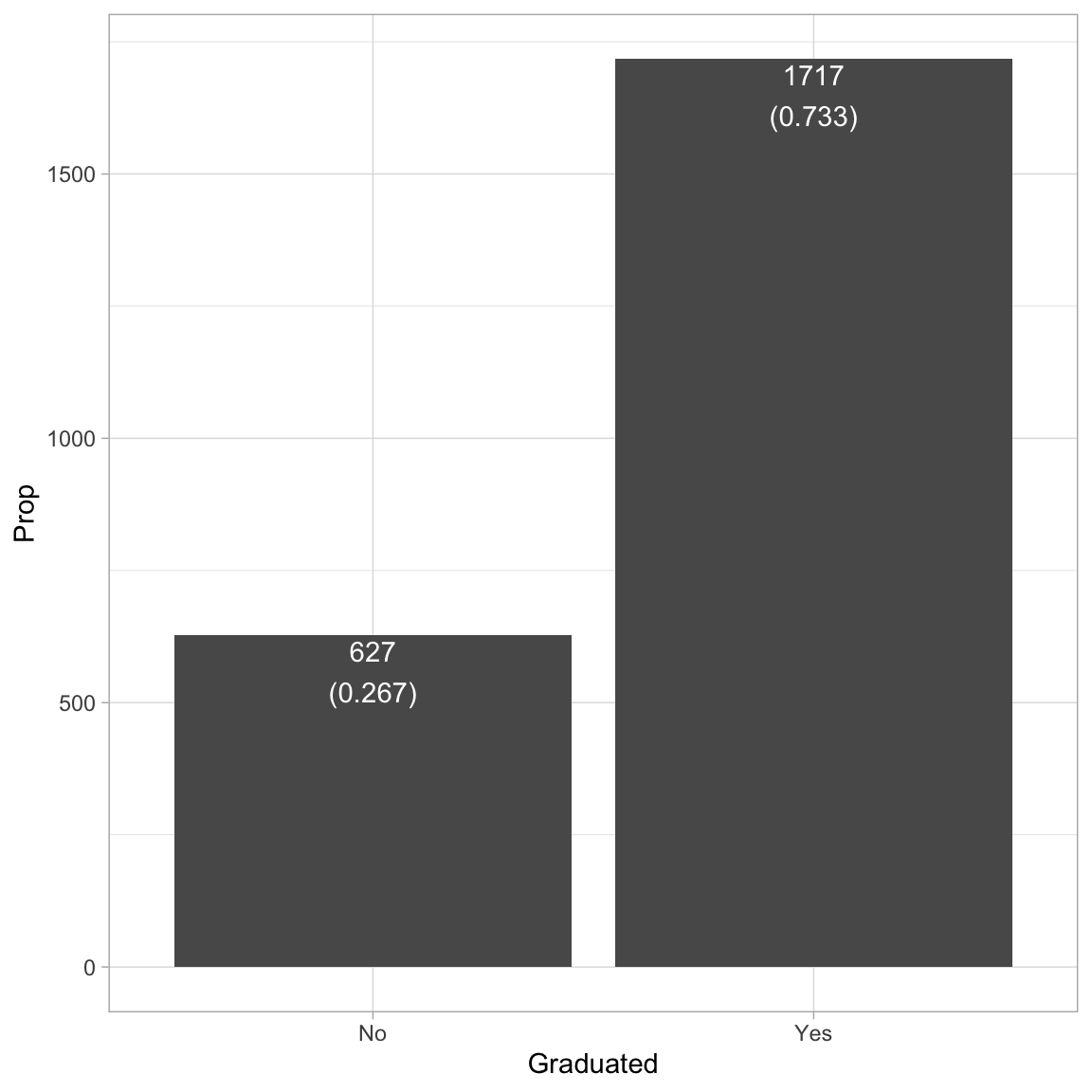
The analysis suggests that most students in the sample (73%) tend to graduate. Because we ultimately want to use this variable in our analysis, we will need to create a numeric indicator variable for use in those analysis by dummy-coding the degree variable.
# Create dummy-coded degree variable
grad = grad |>
  mutate(
    got_degree = if_else(degree == "Yes", 1, 0)
  )

# View data
grad
We will also explore the act variable, which we will use as a predictor in the analysis.
# Density plot
ggplot(data = grad, aes(x = act)) +
  geom_density() +
  theme_light() +
  xlab("ACT score") +
  ylab("Probability density")

# Summary measures
grad |>
  summarize(
    M = mean(act),
    SD = sd(act)
    )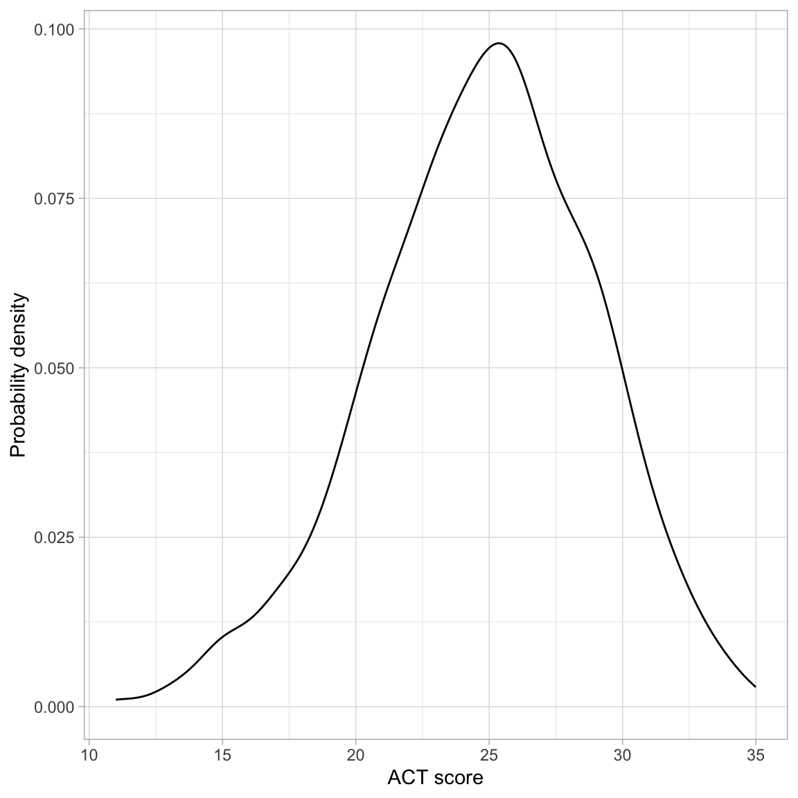
The distribution of ACT scores is unimodal and symmetric. It indicates that the sample of students have a mean ACT score near 25. While there is a great deal of variation in ACT scores (scores range from 10 to 36), most students have a score between 21 and 29.
Relationship between ACT Score and Proportion of Students who Obtain a Degree
Recall that the regression model predicts the average Y at each X. Since our outcome is a dichotomous dummy-coded variable, the average represents the proportion of students with a 1. In other words, the regression will predict the proportion of students who obtained a degree for a particular ACT score. To get a sense for this, we can compute the sample proportion of students who obtained a degree for each ACT score from the data.
# Compute
prop_grad = grad |>
  group_by(act, degree) |>
  summarize(
    N = n()  # Compute sample sizes by degree for each ACT score
    ) |>
  mutate(
    Prop = N / sum (N) #Compute proportion by degree for each ACT score
    ) |>
  filter(degree == "Yes") |> # Only use the "Yes" responses
  ungroup() #Makes the resulting tibble regular

# View data
prop_grad |>
  print(n = Inf) #Print all the rows
# A tibble: 24 × 4
act degree N Prop
<dbl> <chr> <int> <dbl>
1 11 Yes 1 0.25
2 13 Yes 4 0.5
3 14 Yes 6 0.5
4 15 Yes 13 0.448
5 16 Yes 6 0.24
6 17 Yes 18 0.429
7 18 Yes 26 0.531
8 19 Yes 50 0.685
9 20 Yes 74 0.679
10 21 Yes 97 0.678
11 22 Yes 103 0.632
12 23 Yes 149 0.764
13 24 Yes 168 0.789
14 25 Yes 163 0.700
15 26 Yes 190 0.802
16 27 Yes 147 0.778
17 28 Yes 133 0.787
18 29 Yes 132 0.830
19 30 Yes 92 0.793
20 31 Yes 61 0.813
21 32 Yes 41 0.82
22 33 Yes 24 0.828
23 34 Yes 16 1
24 35 Yes 3 0.6 In general, the proportion of students who obtain their degree is higher for higher SAT values. We can also see this same relationship by plotting the proportion of students who graduate versus ACT score.
# Scatterplot
ggplot(data = prop_grad, aes(x = act, y = Prop)) +
  geom_point(aes(size = N)) +
  geom_smooth(data = grad, aes(y = got_degree), method = "loess", se = FALSE,
              color = "red", linetype = "dashed") +
  geom_smooth(data = grad, aes(y = got_degree), method = "lm", se = FALSE) +
  theme_bw() +
  xlab("ACT score") +
  ylab("Proportion of students who obtained a degree")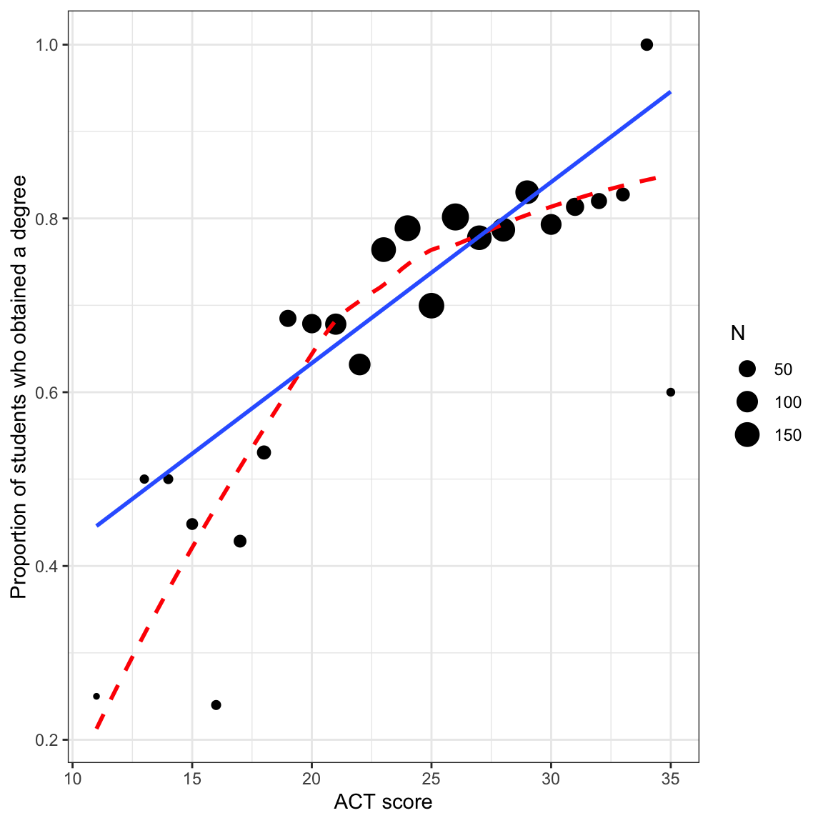
There are a few things to note here:
- The regression line is based on the raw data rather than the proportion data. This is important because the sample sizes differ (e.g., there are far more students who have an ACT score near 25 than near 10).
- Both the regression line and loess smoother indicate there is a positive relationship between ACT score and the proportion of students who graduate. This suggests that higher ACT scores are associated with higher proportions of students who graduate.
- The loess smoother suggests there may be a curvilinear relationship between ACT score and the proportion of students who obtain their degree.
Because the regression is about the proportion of students who obtain their degree, the scatterplot we show should also indicate the proportion of students who graduate. Thus, when the outcome is categorical, we tend not to look at a scatterplot of the raw data in practice.
# Scatterplot
ggplot(data = grad, aes(x = act, y = got_degree)) +
  geom_point() +
  geom_smooth(method = "loess", se = FALSE, color = "red", linetype = "dashed") +
  geom_smooth(method = "lm", se = FALSE) +
  theme_bw() +
  xlab("ACT score") +
  ylab("Graduated")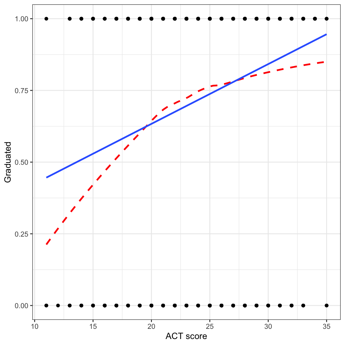
Since the raw data can only have outcome values of 0 or 1, we don’t see many of the observations (this is called overplotting). More importantly, the regression line and loess smoother, which indicates the proportion of students who graduate is using a different scale (values between 0 and 1) than the raw data (only values of 0 or 1).Because of this scale incompatibility, this plot is generally not provided in practice.
We can also see the positive relationship between ACT score and the proportion of students who obtain their degree by examining the correlation matrix between the two variables. The correlation coefficient suggests a weak, positive relationship, but we interpret this with caution since the relationship may not be linear (as suggested by the loess smoother).
# Correlation
grad |>
  select(got_degree, act) |>
  correlate()
Fitting the Linear Probability (Proportion) Model
We can fit the linear model shown by the regression line in the plot using the lm() function as we always have. The name of this model when we have a dichotomous outcome in a linear model, is the linear probability (proportion) model.
# Fit the model
lm.1 = lm(got_degree ~ 1 + act, data = grad)

# Model-level- output
glance(lm.1)
Differences in ACT score account for 3.8% of the variation in graduation.
# Coefficient-level- output
tidy(lm.1)
The fitted model is:
\[ \hat{\pi}_i = 0.22 + 0.02(\mathrm{ACT~Score}_i) \]
where \(\hat{\pi}_i\) is the predicted proportion of students who graduate. (Note that we use \(\hat{\pi}_i\) rather than \(Y_i\) since the outcome is now a proportion rather than the raw outcome value.) Interpreting the coefficients,
- On average, 0.22 of students having an ACT score of 0 are predicted to graduate. (Extrapolation)
- Each one-point difference in ACT score is associated with an additional 0.02 predicted improvement in the proportion of students graduating, on average.
Let’s examine the model assumptions.
# Examine residual plots
residual_plots(lm.1)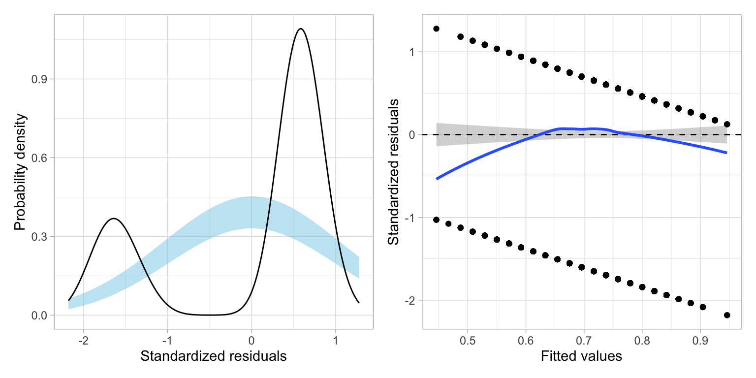
It is clear that the assumptions associated with linear regression are violated. First off, the residuals are not normally distributed. They are in fact, bimodal. The scatterplot of the residuals versus the fitted values also indicates violation of the linearity assumption, as the average residual at each fitted value is not zero. The only assumption that seems tenable is homoskedasticity.
Understanding the Residuals from the Linear Probability Model
Look closely at the scatterplot of the residuals versus the fitted values. At each fitted value, there are only two residual values. Why is this? Recall that residuals are computed as \(\epsilon_i=Y_i - \hat{Y}_i\). Now, remember that \(Y_i\) can only be one of two values, 0 or 1. Also remember that in the linear probability model \(\hat{Y}_i=\hat{\pi}_i\). Thus, for \(Y=0\),
\[ \begin{split} \epsilon_i &= 0 - \hat{Y}_i \\ &= - \hat{\pi}_i \end{split} \]
And, if \(Y=1\),
\[ \begin{split} \epsilon_i &= 1 - \hat{Y}_i \\ &= 1 - \hat{\pi}_i \end{split} \]
This means that the residual computed using a particular fitted value can only take on one of two values: \(- \hat{\pi}_i\) or \(1 - \hat{\pi}_i\). Likewise, the standardized residuals can only take on two values for each fitted value.That is why in the plot of the standardized residuals versus the fitted values we do not see any scatter; there are only two possibilities for the standardized residuals at each fitted value.
Furthermore, the residual (and therefore the standardized residuals) are always the same distance apart for each fitted value, and get smaller for higher fitted values. This is why we see the two parallel strips (having negative slopes) in this plot.
If we plot a distribution of these residuals, we will get two humps; one centered based on the distribution of \(1 - \hat{\pi}_i\) residuals and one centered based on the \(-\hat{\pi}_i\) residuals. This is why we see the bimodal distribution when we look at the density plot of the standardized residuals.
Fitting a linear model when the outcome is dichotomous will result in gross violations of the distributional assumptions. In the next set of notes we will examine more appropriate models for modeling variation in dichotomous categorical outcomes.
Footnotes
We could also have used the original
graddata set in ourdata=argument ofggplot(). In that case we would not usestat="Identity")in thegeom_bar()layer since the counts would be computed for us from the raw data.↩︎Note that
\ncreates a newline to put the proportions on a separate line from the counts.↩︎