# Load libraries
library(broom)
library(corrr)
library(dplyr)
library(ggplot2)
library(readr)

# Import data
keith = read_csv(file = "https://raw.githubusercontent.com/zief0002/modeling/main/data/keith-gpa.csv")

# View data
keith12 Understanding Statistical Control
Remember that in a previous chapter we had found that time spent on homework was positively related to student GPA. Because the data are observational (we did not assign students to different levels of time on homework), it is difficult to make a causal inference about this relationship; there may be an alternative explanation. One possible explanation is that parent level of education explains the positive relationship between time spent on homework and student GPA.
In this chapter, you will learn about how including multiple predictors into the regression model helps us evaluate these alternative explanations by providing a measure of statistical control. To do so, we will return to the keith-gpa.csv data to examine whether time spent on homework is related to GPA (see the data codebook). However this time, we will control for parent education level. To begin, we will load several libraries and import the data into an object called keith.
12.1 Data Exploration of Parent Education Level
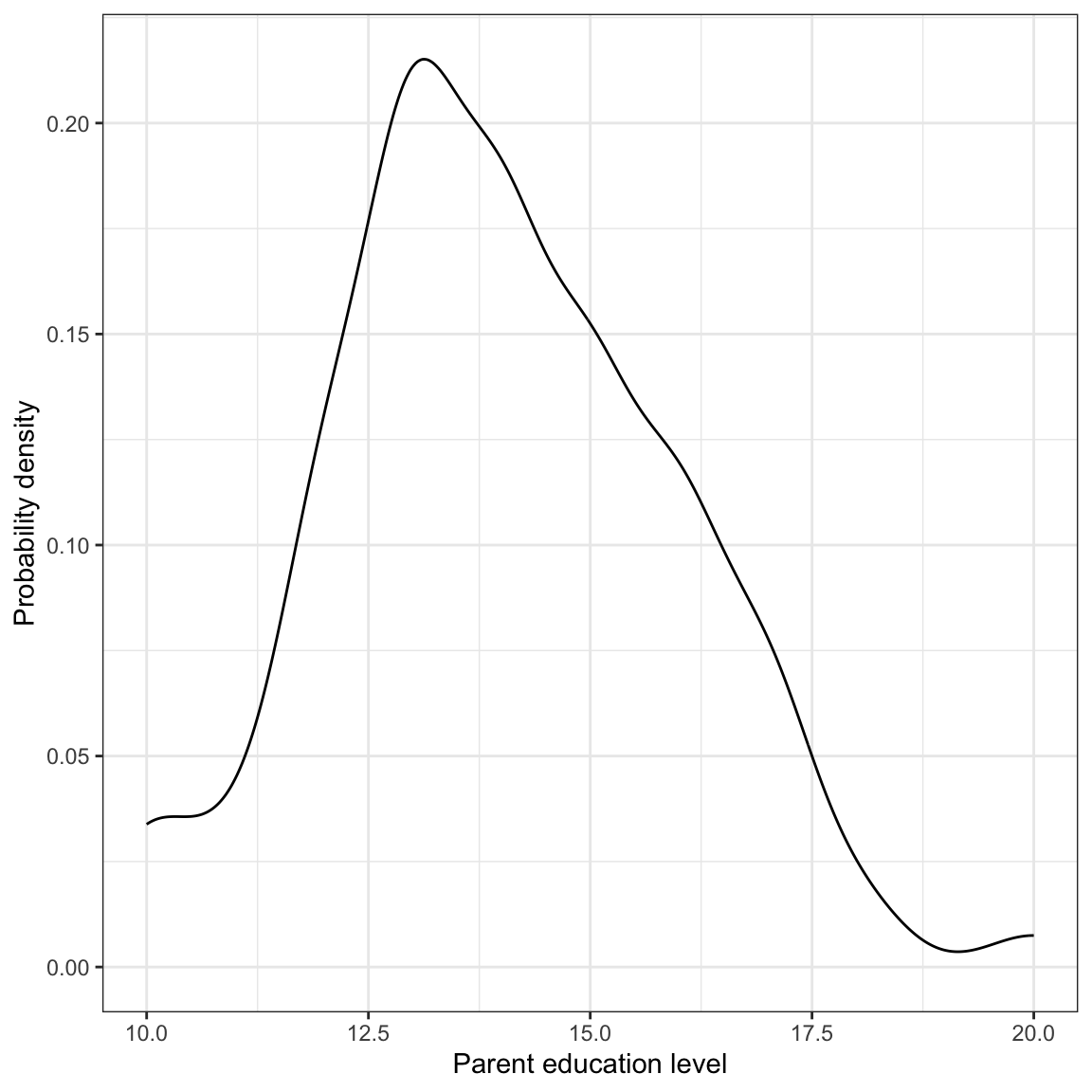
Figure 12.1 (syntax not shown) suggests that the distribution of parent education level is slightly right-skewed. The mean level of education is approximately 14 years (SD = 2 years). Parent-level of education is positively correlated with GPA and with time spent on homework.
| 1. | 2. | 3. | |
|---|---|---|---|
| 1. GPA | |||
| 2. Time spent on homework | |||
| 3. Parent education level |
Parent education level is moderately and positively correlated with student GPA (in the sample). Moreover, time spent on homework is also moderately and positively correlated with parent education level. This set of relationships is in line with our alternative explanation of the relationship between time spent on homework and students’ GPAs. Namely that students who have parent with more education tend to spend more time on homework and thus have higher GPAs.
12.2 Regression Analysis
Table 12.1 shows the results from fitting a series of models to examine the effect of time spent on homework on student GPA.
# Simple regression model to examine effect of time spent on homework
lm.a = lm(gpa ~ 1 + homework, data = keith)
#glance(lm.a)
#tidy(lm.a)

# Control for parent education level
lm.b = lm(gpa ~ 1 + homework + parent_ed, data = keith)
#glance(lm.b)
#tidy(lm.b)| Predictor | Model 1 | Model 2 |
|---|---|---|
| Time spent on homework |
1.21 (0.35) |
0.99 (0.36) |
| Parent education level |
0.87 (0.38) |
|
| Constant |
74.3 (1.94) |
63.2 (5.24) |
| R2 | 0.107 | 0.152 |
| RMSE | 7.24 | 7.09 |
The results from Model 1 are consistent with time spent on homework having a positive association with GPA (\(p<.001\)). Each one hour difference in time spent on homework is associated with a 1.21-point difference in GPA, on average. This positive association is seen, even after controlling for parent education level (see Model 2; \(p=.026\)), although the effect is somewhat smaller, with each one hour difference in time spent on homework is associated with a 0.98-point difference in GPA, on average.
These results argue against the alternative explanation that it is really parent education level that is explaining both time spent on homework and students’ GPAs. The results from the multiple regression model argue that after we account for the fact that parent education is related to both those variables, there is still a positive, albeit smaller, relationship between time spent on homework and students’ GPAs. To understand why we can rule out this alternative explanation of the relationship, we need to understand the idea of statistical control.
12.3 Understanding Statistical Control via Predicted Values
The fitted equation for Model 2 is,
\[ \hat{\mathrm{GPA}_i} = 63.22 + 0.99(\mathrm{Homework}_i) + 0.87(\mathrm{Parent~Education}_i) \]
Let’s predict the average GPA for students who spend differing amounts of time on homework,
- Time spent on homework = 1 hour
- Time spent on homework = 2 hours
- Time spent on homework = 3 hours
Let’s also assume that these student all have parent education level of 12 years.
| Homework | Parent Education | Model Predicted GPA |
|---|---|---|
In this example, the value of parent_ed is “constant” across the three types of students. Time spent on homework differs by one-hour between each subsequent type of student. The difference in model predicted average GPA between these students is 0.99. When we hold level of parent education constant, the predicted difference in average GPA between students who spend an additional hour on homework is 0.99.
What if we had chosen a parent education level of 13 years instead?
| Homework | Parent Education | Model Predicted GPA |
|---|---|---|
The model predicted average GPAS are higher for these students because they have a higher parent education level. But, again, when we hold parent education level constant, the predicted difference in average GPA between students who spend an additional hour on homework is 0.99. Moreover, this difference in average GPAs for any one hour difference in time spent on homework will be 0.99, regardless of the value we pick for parent level of education.
By fixing the value of parent level of education to a particular value (holding it constant) we can “fairly” compare the average predicted GPA for different values of time spent on homework. This allows us to evaluate the association between time spent on homework and GPA without worrying that the GPAs we are comparing have different values for parent level of education. By holding parent level of education constant, we remove it as a potentially confounding explanation of the relationship between time spent on homework and students’ GPAs.
12.4 Understanding Statistical Control via the Fitted Model
Let us return to the fitted equation for Model 2,
\[ \hat{\mathrm{GPA}_i} = 63.22 + 0.99(\mathrm{Homework}_i) + 0.87(\mathrm{Parent~Education}_i) \]
But this time, instead of computing predicted values, let’s focus on the fitted equation for students with a specified parent education level, say 12 years. We can substitute this value into the fitted equation and reduce the result.
\[ \begin{split} \hat{\mathrm{GPA}_i} &= 63.22 + 0.99(\mathrm{Homework}_i) + 0.87(\mathrm{12}) \\[2ex] &= 63.22 + 0.99(\mathrm{Homework}_i) + 10.44 \\[2ex] &= 73.66 + 0.99(\mathrm{Homework}_i) \end{split} \]
By substituting in a constant value for parent education level, we can write the model so that GPA is a function of time spent on homework. Interpreting the coefficients,
- Students with a parent education level of 12 years and who spend 0 hours a week on homework are predicted to have a mean GPA of 73.66.
- For students with a parent education level of 12 years, each additional hour spent on homework is associated with a 0.99-pt difference in GPA, on average.
What about the students whose parent education level is 13? Substituting this value into the fitted equation and reducing the result, we get,
\[ \begin{split} \hat{\mathrm{GPA}_i} &= 63.22 + 0.99(\mathrm{Homework}_i) + 0.87(\mathrm{13}) \\[2ex] &= 63.22 + 0.99(\mathrm{Homework}_i) + 11.31 \\[2ex] &= 74.53 + 0.99(\mathrm{Homework}_i) \end{split} \]
Interpreting these coefficients,
- Students with a parent education level of 13 years and who spend 0 hours a week on homework are predicted to have a mean GPA of 74.53.
- For students with a parent education level of 13 years, each additional hour spent on homework is associated with a 0.99-pt difference in GPA, on average.
The key here is that the slope for these two sets of students is the same. The relationship between time spent on homework and GPA is exactly the same regardless of parent education level.
12.5 Understanding Statistical Control via the Plot of the Fitted Model
To create a plot that helps us interpret the results of a multiple regression analysis, we pick fixed values for all but one of the predictors and substitute those into the fitted equation. We can then rewrite the equation and use geom_abline() to draw the fitted line. Below I illustrate this by choosing three fixed values for parent level of education (namely 8, 12, and 16) and rewriting the three equations.
Parent education level = 8
\[ \begin{split} \hat{\mathrm{GPA}_i} &= 63.22 + 0.99(\mathrm{Homework}_i) + 0.87(\mathrm{8}) \\[2ex] &= 70.18 + 0.99(\mathrm{Homework}_i) \end{split} \]
Parent education level = 12
\[ \begin{split} \hat{\mathrm{GPA}_i} &= 63.22 + 0.99(\mathrm{Homework}_i) + 0.87(\mathrm{12}) \\[2ex] &= 73.66 + 0.99(\mathrm{Homework}_i) \end{split} \]
Parent education level = 16
\[ \begin{split} \hat{\mathrm{GPA}_i} &= 63.22 + 0.99(\mathrm{Homework}_i) + 0.87(\mathrm{16}) \\[2ex] &= 77.14 + 0.99(\mathrm{Homework}_i) \end{split} \]
Now I will create a plot of the outcome versus the predictor we left as a variable in the three equations (time spent on homework) and use geom_abline() to include the line for each of the three rewritten equations. Note that since I have three different equations (one for each of the three parent education levels), I will need to include three layers of geom_abline() in the plot syntax.
ggplot(data = keith, aes(x = homework, y = gpa)) +
  geom_point(alpha = 0) +
  theme_bw() +
  xlab("Time spent on homework") +
  ylab("Model predicted GPA") +
  geom_abline(intercept = 70.18, slope = 0.99, color = "#003f5c", linetype = "dotdash") +
  geom_abline(intercept = 73.66, slope = 0.99, color = "#f26419", linetype = "solid") +
geom_abline(intercept = 77.14, slope = 0.99, color = "#b40f20", linetype = "dashed") 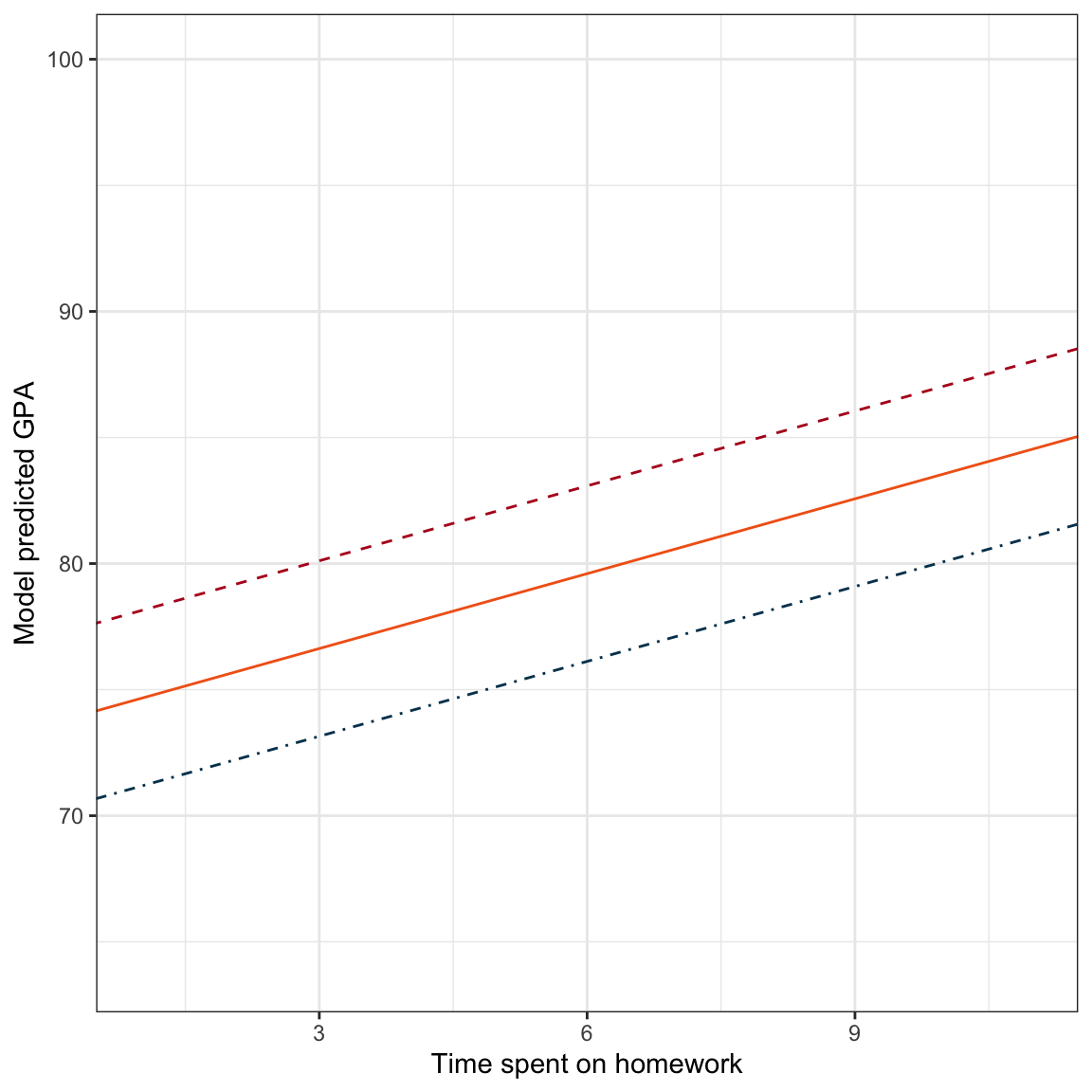
From the plot we can see the effect of time spent on homework in the slopes of the fitted lines. Regardless of the level of parent education (8, 12, or 16), the slope of the line is 0.99, which means the three lines are parallel. The intercepts of these three lines vary reflecting the different level of parent education.
We can interpret the effect of parent level of education by fixing time spent on homework to a particular value on the same plot. For example, by fixing time spent on homework to 6, we see that the average GPA varies for the three levels of parent education displayed in the plot.
ggplot(data = keith, aes(x = homework, y = gpa)) +
  geom_point(alpha = 0) +
  theme_bw() +
  xlab("Time spent on homework") +
  ylab("Model predicted GPA") +
  geom_abline(intercept = 70.18, slope = 0.99, color = "#003f5c", linetype = "dotdash") +
  geom_abline(intercept = 73.66, slope = 0.99, color = "#f26419", linetype = "solid") +
  geom_abline(intercept = 77.14, slope = 0.99, color = "#b40f20", linetype = "dashed") +
  geom_point(x = 6, y = 76.11908, color = "#003f5c", size = 2) +
  geom_point(x = 6, y = 79.60157, color = "#f26419", size = 2) +
  geom_point(x = 6, y = 83.08407, color = "#b40f20", size = 2)
How much do the model predicted GPAs vary for these three parent education levels?
| Homework | Parent Education | Model Predicted GPA |
|---|---|---|
The difference between each of these subsequent model predicted GPA values is 3.48. This is constant because we chose parent education levels that differ by the same amount, in this case each value of parent education differs by four years.
12.5.1 Effect of Parent Education Level
What if we would have chosen parent education levels that differed by one year rather than by four years?
| Homework | Parent Education | Model Predicted GPA |
|---|---|---|
Now a one-year difference in parent education level is associated with a 0.87-point difference in predicted GPA, holding time spent on homework constant. We could also have calculated this directly from the earlier result. Since a four-year difference in parent education is associated with a 3.48-point difference in predicted GPA, a one-year difference in parent education is associated with a \(3.48 / 4=0.87\)-point difference in predicted GPA. This algebra works since the relationship is constant (i.e., linear).
12.6 Triptych Plots: Displaying the Results from a Multiple Regression Model
Remember, to create a plot that helps us interpret the results of a multiple regression analysis, we pick fixed values for all but one of the predictors and substitute those into the fitted equation. We can then rewrite the equation and use geom_abline() to draw the fitted lines. We illustrated this earlier by choosing three fixed values for parent level of education (namely 8, 12, and 16) and rewriting the three equations:
\[ \begin{split} \mathbf{Parent~Education=8:} \quad\hat{\mathrm{GPA}_i} &= 70.18 + 0.99(\mathrm{Homework}_i) \\[2ex] \mathbf{Parent~Education=12:} \quad\hat{\mathrm{GPA}_i} &= 73.66 + 0.99(\mathrm{Homework}_i) \\[2ex] \mathbf{Parent~Education=16:} \quad\hat{\mathrm{GPA}_i} &= 77.14 + 0.99(\mathrm{Homework}_i) \end{split} \]
The plot we created earlier put all three fitted lines on the same plot. An alternative plot is to show each line in a different plot, and to place these plots side-by-side in a “triptych”. (I borrow this terminology from McElreath (2016) who coined this in his Statistical Rethinking book.) To do this we save each plot into an object and then use functionality from the patchwork package to put the plots side-by-side.
# Load package
library(patchwork)

# Create plot 1
p1 = ggplot(data = keith, aes(x = homework, y = gpa)) +
      geom_point(alpha = 0) +
      geom_abline(intercept = 70.18, slope = 0.99) +
      theme_bw() +
      xlab("Time spent on homework") +
      ylab("Model predicted GPA") +
      ggtitle("Parent Education = 8 Years")

# Create plot 2
p2 = ggplot(data = keith, aes(x = homework, y = gpa)) +
      geom_point(alpha = 0) +
      geom_abline(intercept = 73.66, slope = 0.99) +
      theme_bw() +
      xlab("Time spent on homework") +
      ylab("Model predicted GPA") +
      ggtitle("Parent Education = 12 Years")

# Create plot 3
p3 = ggplot(data = keith, aes(x = homework, y = gpa)) +
      geom_point(alpha = 0) +
      geom_abline(intercept = 77.14, slope = 0.99) +
      theme_bw() +
      xlab("Time spent on homework") +
      ylab("Model predicted GPA") +
      ggtitle("Parent Education = 16 Years")

# Put plots side-by-side
p1 | p2 | p3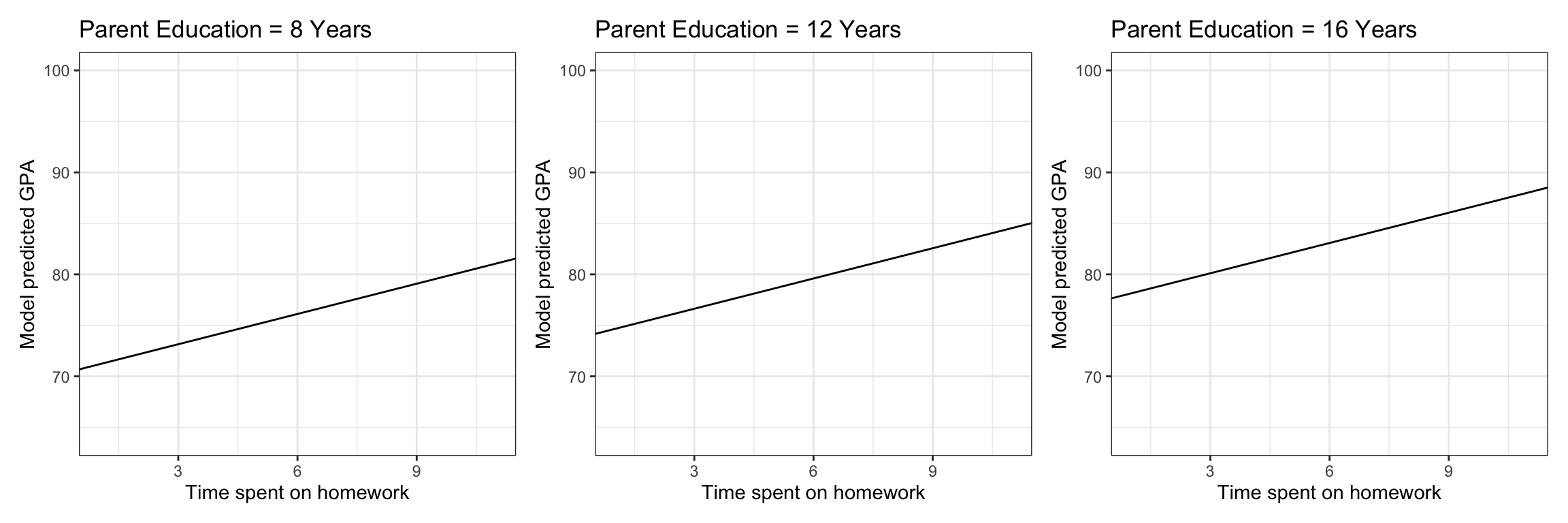
12.6.1 Emphasis on the Effect of Parent Level of Education
With two (or more) effects in the model we have more than one potential way to display the fitted results. In general, we will display one predictor through the slope of the line plotted (same as we did with only one predictor), and EVERY OTHER predictor will be shown through one or more lines. In the previous plots, below, we have displayed the effect of time spent on homework (on the x-axis) through the slope of the lines, and the effect of parent level of education through the vertical distance between the three different lines.
In general, the partial effect seen via the slope of the line is more cognitively apparent than the vertical distance between different lines. Thus whichever effect you want to emphasize should be placed on the x-axis; or left as a variable when you algebraically simplify the fitted regression equation.
For example, what if we wanted to emphasize parent level of education? In that case, we would choose fixed values for time spent on homework, substitute these into the fitted equation, and simplify. Here we choose fixed values for time spent on homework of 2, 5, and 10 hours. Rewriting the three equations:
\[ \begin{split} \mathbf{Homework=2:} \quad\hat{\mathrm{GPA}_i} &= 65.18 + 0.87(\mathrm{Parent~Education}_i) \\[2ex] \mathbf{Homework=5:} \quad\hat{\mathrm{GPA}_i} &= 68.14 + 0.87(\mathrm{Parent~Education}_i) \\[2ex] \mathbf{Homework=10:} \quad\hat{\mathrm{GPA}_i} &= 73.08 + 0.87(\mathrm{Parent~Education}_i) \end{split} \]
Then we create the triptych plot showing the resulting equations:
# Create plot 1
p4 = ggplot(data = keith, aes(x = parent_ed, y = gpa)) +
      geom_point(alpha = 0) +
      geom_abline(intercept = 65.18, slope = 0.87) +
      theme_bw() +
      xlab("Parent education (in years)") +
      ylab("Model predicted GPA") +
      ggtitle("Time Spent on Homework = 2 Hours")

# Create plot 2
p5 = ggplot(data = keith, aes(x = parent_ed, y = gpa)) +
      geom_point(alpha = 0) +
      geom_abline(intercept = 68.14, slope = 0.87) +
      theme_bw() +
      xlab("Parent education (in years)") +
      ylab("Model predicted GPA") +
      ggtitle("Time Spent on Homework = 5 Hours")

# Create plot 3
p6 = ggplot(data = keith, aes(x = parent_ed, y = gpa)) +
      geom_point(alpha = 0) +
      geom_abline(intercept = 73.08, slope = 0.87) +
      theme_bw() +
      xlab("Parent education (in years)") +
      ylab("Model predicted GPA") +
      ggtitle("Time Spent on Homework = 10 Hours")

# Put plots side-by-side
p4 | p5 |p6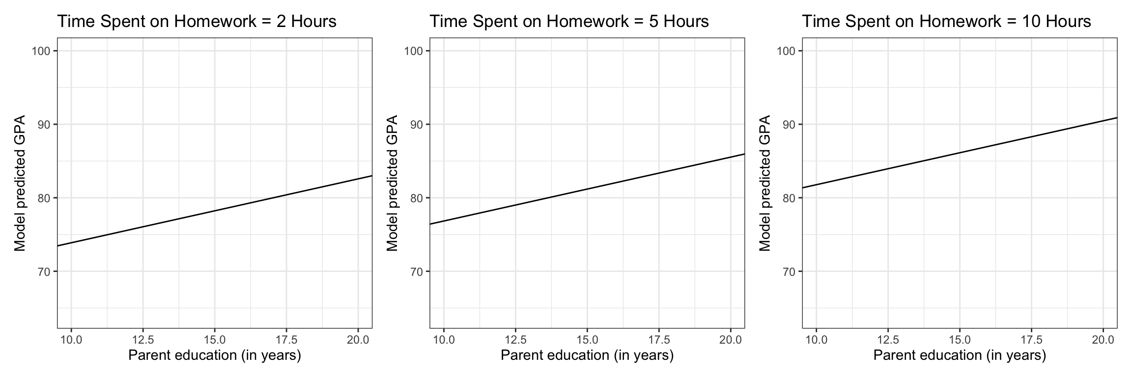
12.7 Only Displaying a Single Effect
Sometimes you only want to show the effect of a single predictor from the model. For example, in educational studies we often control for SES and mother’s level of education when we fit the model, but we don’t want to display those effects in our plot. There is no rule that just because you included an effect in the fitted model that you are obligated to display it.
Any effect that you do not want to display graphically can be fixed to a single value, typically the mean value. Fixing the effect to a single value will produce only one line. For example, here we set the parent education value to its mean value of 14.03 years. After substituting this value into the fitted equation, this results in,
\[ \hat{\mathrm{GPA}_i} = 75.43 + 0.99(\mathrm{Homework}_i) \]
Plotting this we get a single line which displays the effect of time spent on homework on GPA. Even though the effect of parent education is not displayed, it is still included as the intercept value of the plotted line is based on fixing this effect to its mean.
ggplot(data = keith, aes(x = homework, y = gpa)) +
 geom_point(alpha = 0) +
 geom_abline(intercept = 75.43, slope = 0.99) +
 theme_bw() +
 xlab("Time spent on homework") +
 ylab("Model predicted GPA")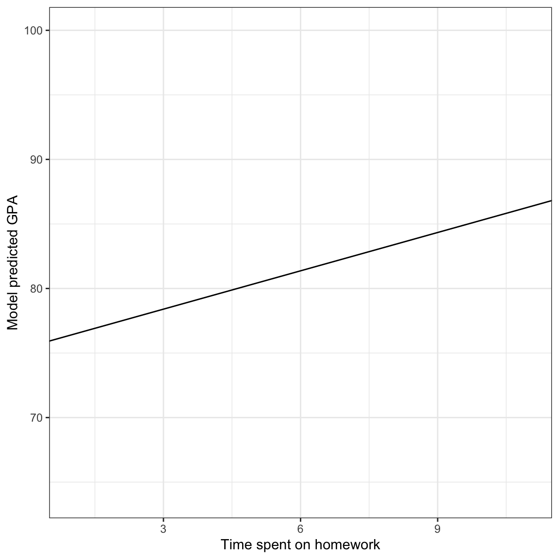
McElreath, R. (2016). Statistical rethinking: A Bayesian course with examples in R and Stan. CRC Press.