@alimotion with five different annotations that explain the data.
This chapter will focus on how we can continue to improve the information conveyed in a plot by adding annotations.
Annotations are the text and guides (e.g., arrows) that explain or clarify information in a plot. They often provide additional context or information to aid readers in interpreting the data. Figure 8.1 shows a plot of the men’s marathon world record times from 1908–2014. This plot has five annotations that further explain interesting aspects of the plot by adding context about the data.
@alimotion with five different annotations that explain the data.
It is important to think about what aspects of the plot to annotate. Yau (2013) provides some advice on this, suggesting that some things to consider annotating are highlighted elements, outliers, clusters, explanations of trends, important contextual milestones or reference points, and interesting observations. For example, consider the five annotations in Figure 8.1:
In addition to the text, each of the annotations also includes a short light-grey line that links the text annotation to a particular data point.
The first annotation point out an interesting finding in the data where there was a large drop in the world record time over a short period of time. The second annotation indicates a cluster of data points that have an interesting contextual story (they all belong to the same person). The third annotation indicates an important contextual milestone, namely the breaking of the 2:10 barrier. The fourth annotation explains several highlighted data points and why they are highlighted. The last annotation again points out something of interest contextually (namely who the current record holder was at the time the plot was made).
Consider the plot shown in Figure 8.2. This shows the weekly median pay for both men and women for 39 occupations identified as “professional occupations” by the United States Bureau of Labor Statistics. One goal of such a plot is to look at pay gaps between men and women.
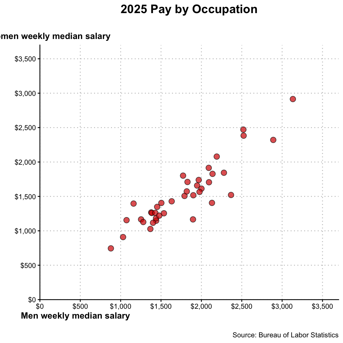
What annotations might yuo add to this plot? We could describe the trend in the plot—it is an upward trend indicating that occupations in which men make a higher weekly salary are the same occupations in which women make a higher weekly salary. While this describes the trend, it doesn’t necessarily help readers understand gender pay gaps.
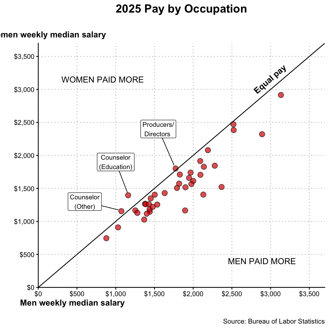
In a similar plot based on 2011 data Yau (2013) suggested several annotations that would help contextualize pay gaps in these occupations. Figure 8.3 shows the plot of weekly median pay for both men and women but also includes several of Yau’s annotations.
It isn’t always clear what annotations might be useful. The best way to figure this out is to have other people give you feedback about how they are interpreting your plot, what they find interesting, and what they don’t understand. As Yau pointed out:
In the end, you must consider what your audience will or might not understand graphically and statistically, and annotate based on that (Yau, 2013, p. 233).
To illustrate how to add annotations to a data visualizations, we will work with the mn-colleges.csv data. In the first code chunk of your QMD document, load the {tidyverse} library and use the read_csv() function to import the mn-colleges.csv data and assign the data into an object called mn. (You also might want to view the data to ensure that it imported into the QMD correctly.) Don’t forget to add code comments as well!
# Load libraries
library(tidyverse)

# Import data
mn <- read_csv("data/mn-colleges.csv")
We will create a histogram of the number of applicants in a new code chunk in the QMD document. We will also add a title, subtitle, caption and axes labels using the labs() layer using the following syntax:
ggplot(data = mn, aes(x = applicants)) +
  geom_histogram(
    breaks = seq(from = 0, to = 42000, by = 2000),
    color = "black",
    fill = "#FFB71E"
  ) +
  labs(
    title = "How Many Students Apply to College? ",
    subtitle = "The number of applicants for the 33 institutions of higher education in Minnesota.\n",
    caption = "\nSOURCE: https://www.acceptancerate.com/minnesota",
    x = "Number of applicants",
    y = "Count"
  )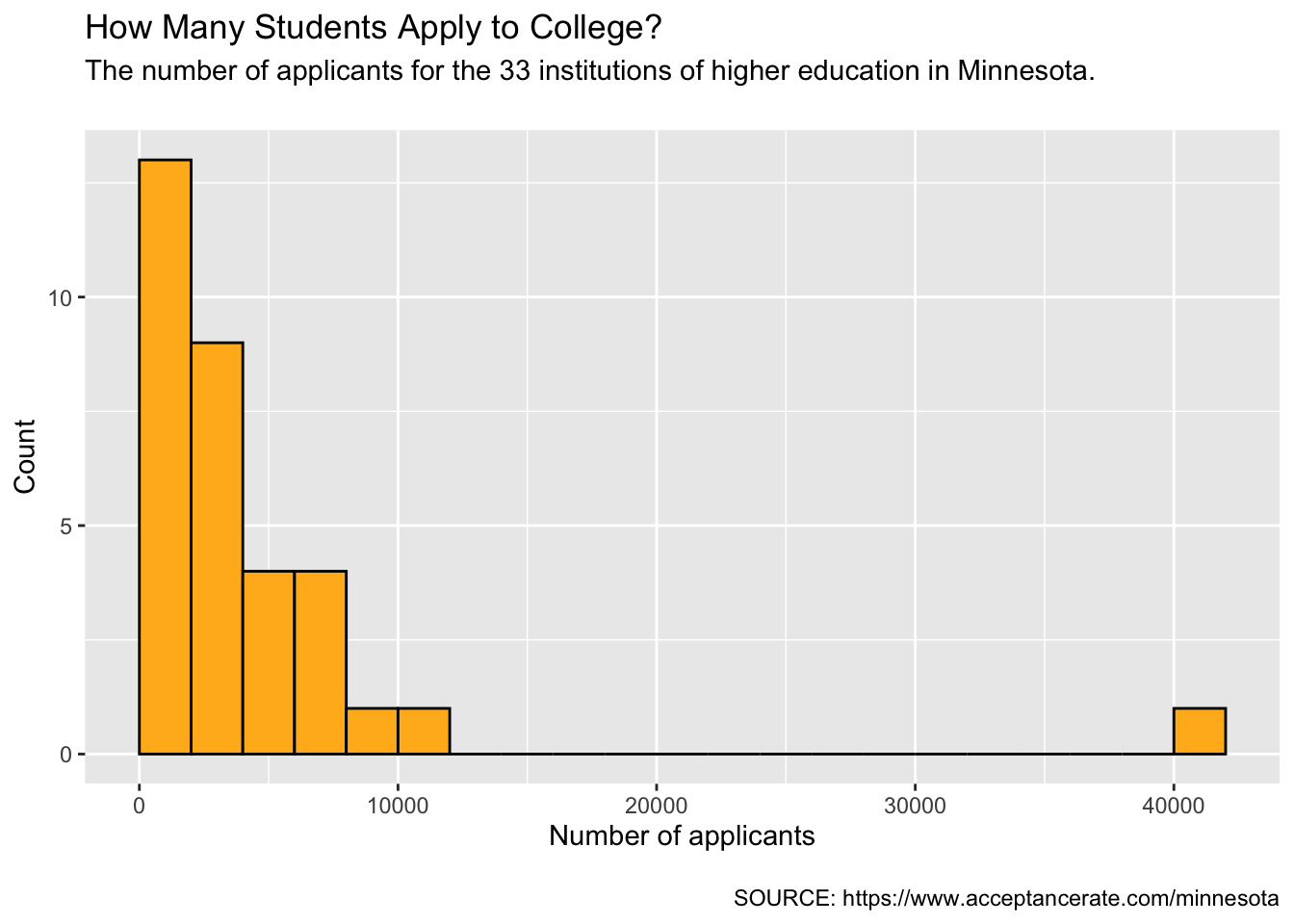
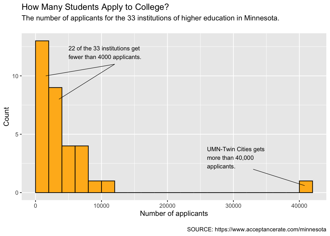
Two annotations that might help readers contextualize and make sense about of plot are:
To add annotations, we include annotate() layers to our plot code, one for each annotation. The syntax for this layer when adding a text annotation looks like the following:
annotate("text", x = , y = , label = "")The string "text" indicates that the annotation is text. The arguments x= and y= give the x- and y-coordinates where you want the text annotation to appear in the plot. Finally, the label= argument includes the text that you want to appear in the annotation.
For example, let’s add the first annotation at the coordinate (5000, 12). Note that picking the coordinates for your annotation is a bit of trial-and-error. Pick a coordinate that seems reasanable to start, and then change it until you get it to look good.
ggplot(data = mn, aes(x = applicants)) +
  geom_histogram(
    breaks = seq(from = 0, to = 42000, by = 2000),
    color = "black",
    fill = "#FFB71E"
  ) +
  labs(
    title = "How Many Students Apply to College? ",
    subtitle = "The number of applicants for the 33 institutions of higher education in Minnesota.\n",
    caption = "\nSOURCE: https://www.acceptancerate.com/minnesota",
    x = "Number of applicants",
    y = "Count"
  ) +
  annotate(
    "text",
    x = 5000, y = 11,
    label = "22 of the 33 institutions get\nfewer than 4000 applicants."
    )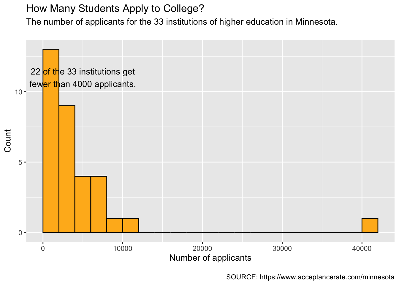
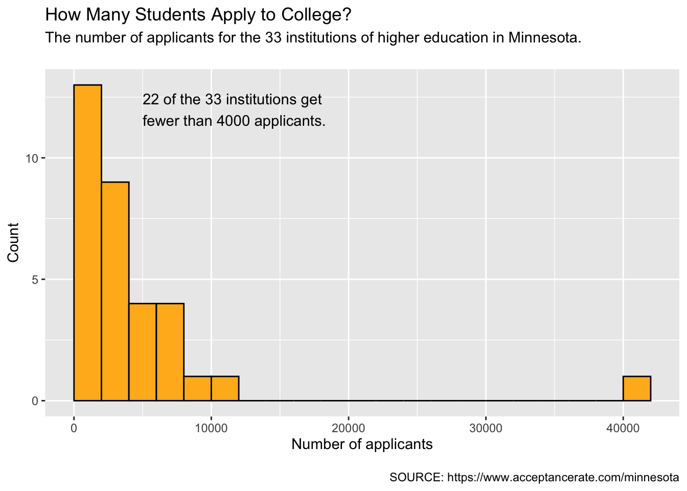
Notice that the text annotation is centered at the coordinate we specified, namely (5000, 12). Instead of centering the text at this coordinate, we want to left-justify the text at this coordinate. To do that, we can include the argument hjust=0. This sets the horizontal justification—this takes a value between 0 and 1 where left justified is 0, right justified is 1, centered (the default) is 0.5.
ggplot(data = mn, aes(x = applicants)) +
  geom_histogram(
    breaks = seq(from = 0, to = 42000, by = 2000),
    color = "black",
    fill = "#FFB71E"
  ) +
  labs(
    title = "How Many Students Apply to College? ",
    subtitle = "The number of applicants for the 33 institutions of higher education in Minnesota.\n",
    caption = "\nSOURCE: https://www.acceptancerate.com/minnesota",
    x = "Number of applicants",
    y = "Count"
  ) +
  annotate(
    "text",
    x = 5000, y = 12,
    label = "22 of the 33 institutions get\nfewer than 4000 applicants.",
    hjust = 0
    )
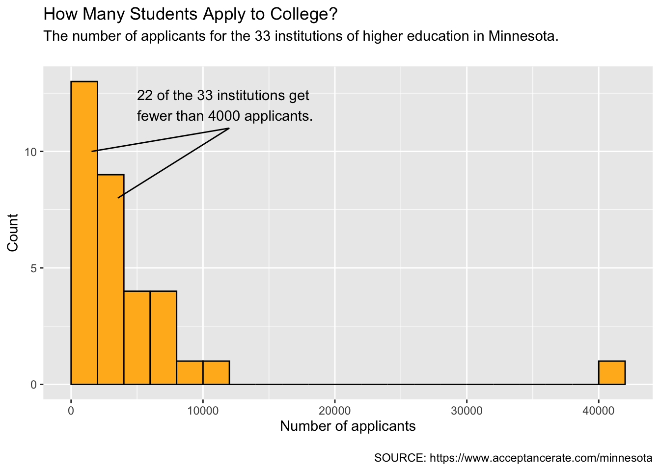
The next thing we will do is add a pointer from the annotated text to the two bars in the histogram that correspond to fewer than 4000 applicants. To do this we will add an annotation that is a line segment rather than text. The syntax for this is as follows:
annotate("segment", x = , y = , xend = , yend =)The line segment extends from the coordinate (x, y) to the coordinate (xend, yend). Since we need two line segments, we need two of these annotation layers. Again, the coordinates you will need are a bit of trial-and-error, adapting them until the pointer looks good.
For our two line segments, we will try:
ggplot(data = mn, aes(x = applicants)) +
  geom_histogram(
    breaks = seq(from = 0, to = 42000, by = 2000),
    color = "black",
    fill = "#FFB71E"
  ) +
  labs(
    title = "How Many Students Apply to College? ",
    subtitle = "The number of applicants for the 33 institutions of higher education in Minnesota.\n",
    caption = "\nSOURCE: https://www.acceptancerate.com/minnesota",
    x = "Number of applicants",
    y = "Count"
  ) +
  annotate(
    "text",
    x = 5000, y = 12,
    label = "22 of the 33 institutions get\nfewer than 4000 applicants.",
    hjust = 0
    ) +
  annotate(
    "segment",
    x = 12000, y = 11,
    xend = 3550, yend = 8
    ) +
  annotate(
    "segment",
    x = 12000, y = 11,
    xend = 1550, yend = 10
    )
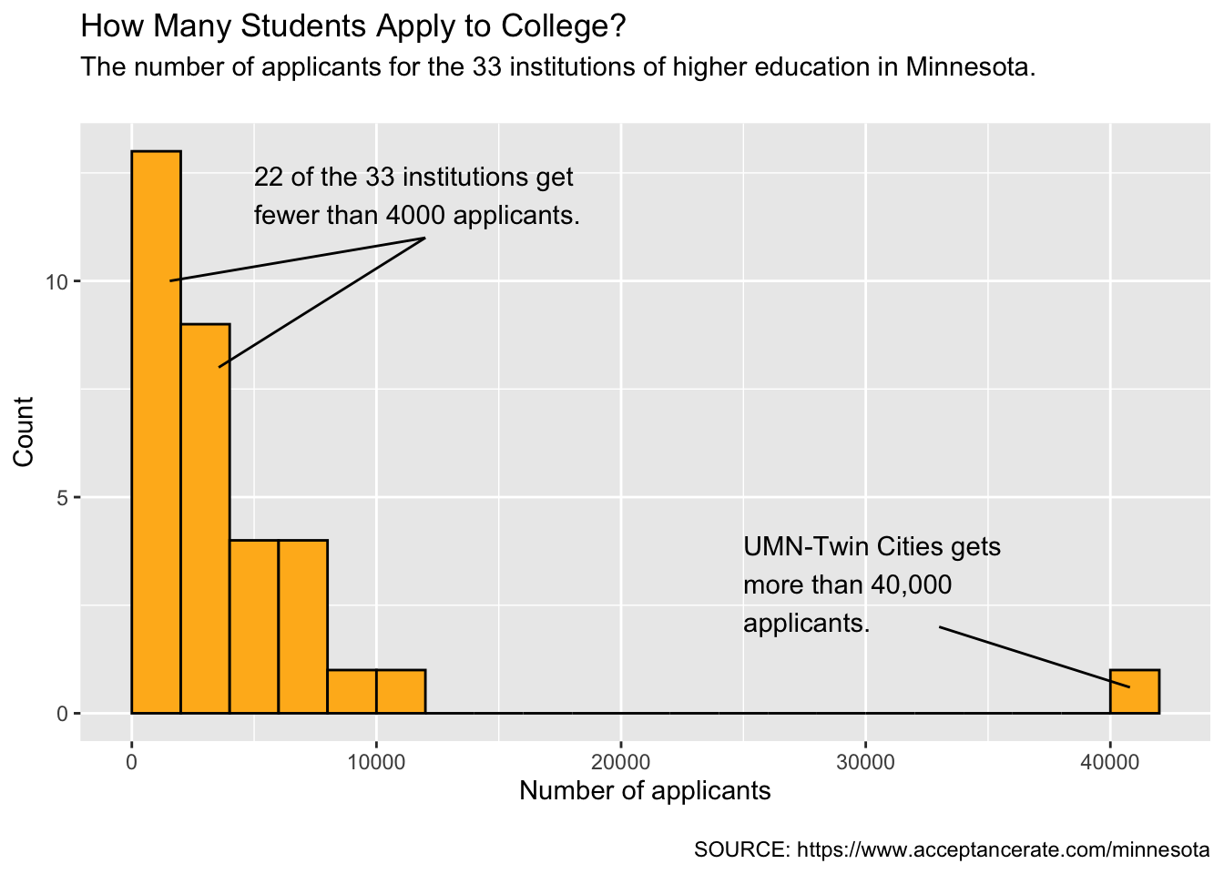
Lastly, we will add another text annotation and pointer to contextualize the outlying institution that gets over 40,000 student applicants.
ggplot(data = mn, aes(x = applicants)) +
  geom_histogram(
    breaks = seq(from = 0, to = 42000, by = 2000),
    color = "black",
    fill = "#FFB71E"
  ) +
  labs(
    title = "How Many Students Apply to College? ",
    subtitle = "The number of applicants for the 33 institutions of higher education in Minnesota.\n",
    caption = "\nSOURCE: https://www.acceptancerate.com/minnesota",
    x = "Number of applicants",
    y = "Count"
  ) +
  annotate(
    "text",
    x = 5000, y = 12,
    label = "22 of the 33 institutions get\nfewer than 4000 applicants.",
    hjust = 0
    ) +
  annotate(
    "segment",
    x = 12000, y = 11,
    xend = 3550, yend = 8
    ) +
  annotate(
    "segment",
    x = 12000, y = 11,
    xend = 1550, yend = 10
    ) +
  annotate(
    "text",
    x = 25000, y = 3,
    label = "UMN-Twin Cities gets\nmore than 40,000\napplicants.",
    hjust = 0
    ) +
  annotate(
    "segment",
    x = 33000, y = 2,
    xend = 40800, yend = 0.6
    )
Lastly, we will make the annotations a bit more aesthetically pleasing. First, we will use a slightly smaller size font on the text annotations. To do this we will add the argument size= (the default size is 4). Second, we will change the width of our pointer segments using the linewidth= argument (the default width is 0.5).
ggplot(data = mn, aes(x = applicants)) +
  geom_histogram(
    breaks = seq(from = 0, to = 42000, by = 2000),
    color = "black",
    fill = "#FFB71E"
  ) +
  labs(
    title = "How Many Students Apply to College? ",
    subtitle = "The number of applicants for the 33 institutions of higher education in Minnesota.\n",
    caption = "\nSOURCE: https://www.acceptancerate.com/minnesota",
    x = "Number of applicants",
    y = "Count"
  ) +
  annotate(
    "text",
    x = 5000, y = 12,
    label = "22 of the 33 institutions get\nfewer than 4000 applicants.",
    hjust = 0,
    size = 3.2
    ) +
  annotate(
    "segment",
    x = 12000, y = 11,
    xend = 3550, yend = 8,
    linewidth = 0.3
    ) +
  annotate(
    "segment",
    x = 12000, y = 11,
    xend = 1550, yend = 10,
    linewidth = 0.3
    ) +
  annotate(
    "text",
    x = 26000, y = 3,
    label = "UMN-Twin Cities gets\nmore than 40,000\napplicants.",
    hjust = 0,
    size = 3.2
    ) +
  annotate(
    "segment",
    x = 33000, y = 2,
    xend = 40800, yend = 0.6,
    linewidth = 0.3
    )
FYI
When you change the size of text, you may need to re-modify coordinates to make it look good again! Similarly, if you change the aspect ratio of your plot, you will also likely need to change them.
labs() layer. Also add at least one text annotation and one segment annotation to this plot.