# Load libraries
library(tidyverse)

# Import data
mn <- read_csv("data/mn-colleges.csv")11 BLAST: A Guide for Layering Your Plots
As you add more and more layers to your plot, it is important to keep your syntax organized. This not only helps you troubleshoot and debug code when you run into problems, but also helps other data scientists read and make sense of your syntax. To help you in this effort, we will organize the layers of our plot using the acronym BLAST.
- (B)ase layers
- (L)abs layer
- (A)nnotation layers
- (S)cale layers
- (T)heme layers
11.1 Example 1: Histogram of College Applicants
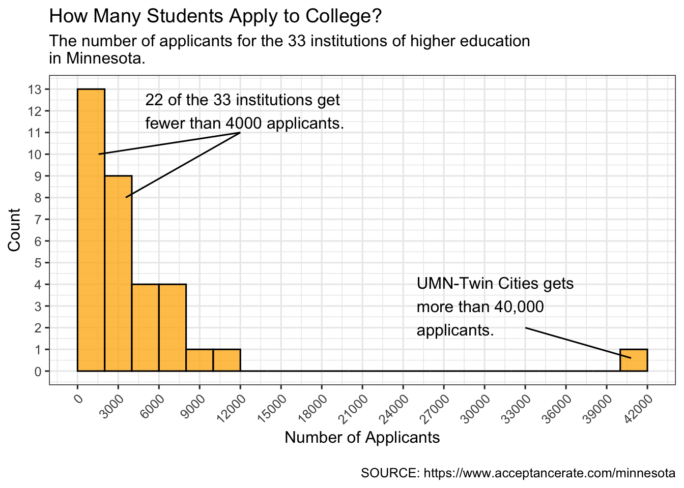
In this example we will create a histogram of the number of applicants for the 33 institutions of higher education in Minnesota. We begin by loading the {tidyverse} library and importing the mn-colleges.csv data.
Below is the syntax we used to create the histogram. Note that the syntax is organized according to BLAST. We also include comments to help you identify these components.
# Base layers
ggplot(data = mn, aes(x = applicants)) +
  geom_histogram(
    breaks = seq(from = 0, to = 42000, by = 2000),
    color = "black", fill = "#FFB71E",
    alpha = 0.8
  ) +
  # Labs layer
  labs(
    title = "How Many Students Apply to College? ",
    subtitle = "The number of applicants for the 33 institutions of higher education\nin Minnesota.",
    caption = "\nSOURCE: https://www.acceptancerate.com/minnesota"
  ) +
  # Annotation layers
  annotate(
    "text",
    x = 5000, y = 12,
    label = "22 of the 33 institutions get\nfewer than 4000 applicants.",
    hjust = 0
    ) +
  annotate(
    "segment",
    x = 12000, y = 11,
    xend = 3550, yend = 8
    ) +
  annotate(
    "segment",
    x = 12000, y = 11,
    xend = 1550, yend = 10
    ) +
  annotate(
    "text",
    x = 25000, y = 3,
    label = "UMN-Twin Cities gets\nmore than 40,000\napplicants.",
    hjust = 0
    ) +
  annotate(
    "segment",
    x = 33000, y = 2,
    xend = 40800, yend = 0.6
    ) +
  # Scale layers
  scale_x_continuous(
    name = "Number of Applicants",
    breaks = seq(from = 0, to = 42000, by = 3000)
    ) +
  scale_y_continuous(
    name = "Count",
    breaks = seq(0, 15, by = 1)
    ) +
  # Theme layers
  theme_bw(base_size = 12) +
  theme(
    axis.text.x = element_text(angle = 45, vjust = 1, hjust = 1)
    )
11.2 Example 2: Horizontal Bar Chart of the Bike Amenities at UMN
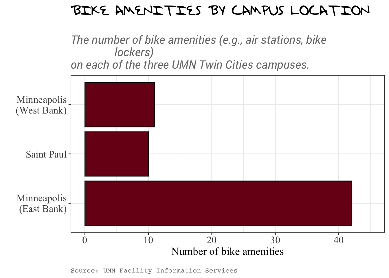
In this example we will create a horizontal bar chart of the number of bike amenities on the UMN campus. We begin by importing the umn-bike-amenities.csv data. (We assume you have already loaded the {tidyverse} package.)
# Load libraries
library(tidyverse)

# Import data
bike_amenities <- read_csv("data/umn-bike-amenities.csv")
Not every plot will include all of these different layers. If that is the case just omit the layers from that part of the acronym. For example, the code shown below has no annotation layers. We just omit those layers but the organization for the remaining layers still follows the BLAST acronym.
# Base layers
ggplot(data = bike_amenities, aes(y = campus)) +
  geom_bar(color = "black", fill = "#7a0019") +
  # Labs layer
  labs(
    title = "BIKE AMENITIES BY CAMPUS LOCATION",
    subtitle = "\nThe number of bike amenities (e.g., air stations, bike
                lockers)\non each of the three UMN Twin Cities campuses.",
    caption = "\nSource: UMN Facility Information Services"
  ) +
  # Scale layers
  scale_x_continuous(
    name = "Number of bike amenities",
    limits = c(0, 45),
    breaks = c(0, 10, 20, 30, 40),
    minor_breaks = c(5, 15, 25, 35, 45)
  ) +
  scale_y_discrete(
    name = "",
    labels = c("Minneapolis\n(East Bank)", "Saint Paul",
               "Minneapolis\n(West Bank)")
  ) +
  # Theme layers
  theme_bw()  +
  theme(
    plot.title = element_text(size = 20, face = "bold", family = "TaylorSwiftHandwriting"),
    plot.subtitle = element_text(size = 15, face = "italic", color = "#797979",
                                 family = "Roboto"),
    plot.caption = element_text(color = "#797979", hjust = 0, family = "mono"),
    axis.title.x = element_text(size = 14, family = "Times New Roman"),
    axis.title.y = element_text(size = 14, family = "Times New Roman"),
    axis.text.x = element_text(size = 13, family = "Times New Roman"),
    axis.text.y = element_text(size = 13, family = "Times New Roman"),
  )
Exercises: Your Turn
- The syntax below uses the bls-earnings.csv data to create a histogram of the median weekly earnings for women who work an occupation in a professional occupation. Organize the layers according to BLAST.
ggplot(data = bls, aes(x = med_weeklypay_women)) +
  geom_histogram(
    breaks = seq(from = 0, to = 3000, by = 200),
    color = "black",
    fill = "#FFB71E"
  ) +
  theme_bw() +
  scale_x_continuous(
    name = "Median weekly earnings",
    breaks = c(0, 500, 1000, 1500, 2000, 2500, 3000),
    labels = c("$0", "$500", "$1000", "$1500", "$2000", "$2500", "$3000")
  ) +
  labs(
    title = "Female Empowerment: Bringing Home the Bacon",
    subtitle = "The median weekly earnings for women in 195 professional occupations.\n",
    caption = "\nSOURCE: Bureau of Labor Statistics"
  ) +
  annotate(
    "text",
    x = 1500, y = 44,
    label = "≤$100k/year",
    family = "Roboto Condensed",
    color = "#616161"
    ) +
  scale_y_continuous(
    name = "Count",
    limits = c(0, 46)
  ) +
  theme(
    # Customize title
    plot.title = element_text(size = 19, face = "bold", family = "Roboto Slab"),

    # Customize subtitle
    plot.subtitle = element_text(size = 15, face = "italic", color = "#797979", family = "Roboto Condensed"),

    # Customize caption
    plot.caption = element_text(color = "#797979", hjust = 0, family = "Roboto"),

    # Customize main axis labels
    axis.title.x = element_text(size = 14, family = "Roboto"),
    axis.title.y = element_text(size = 14, family = "Roboto"),

    # Customize tick labels (numbers and categories)
    axis.text.x = element_text(size = 13, family = "Roboto"),
    axis.text.y = element_text(size = 13, family = "Roboto")
  ) +
  annotate(
    "segment",
    x = 2000, y = 0,
    xend = 2000, yend = 46,
    linewidth = 1.3, linetype = "dashed",
    color = "#616161"
    ) +
  annotate(
    "text",
    x = 2500, y = 44,
    label = ">$100k/year",
    family = "Roboto Condensed",
    color = "#616161"
    )