TinkerPlots 101: Importing Data and Plotting
TinkerPlots is a software tool originally developed for use by middle school students. Its data visualization and modeling capabilities make it an excellent choice for introductory statistics courses. Aside from it functionality to carry out simulations and data analysis, it has many features that help students actually learn and reason about statistics. In this reading, you will learn how to use some of the basic features of TinkerPlots.
Importing Data
One of the first things you need to learn is how to import data into TinkerPlots. TinkerPlots 3 files have the file extension .tp3. You can import these files into TinkerPlots in one of two manners:
- Double-clicking on the .tp3 file.
- Opening TinkerPlots, and selecting
File > Open. You can then navigate to the .tp3 file you want to import and select it.
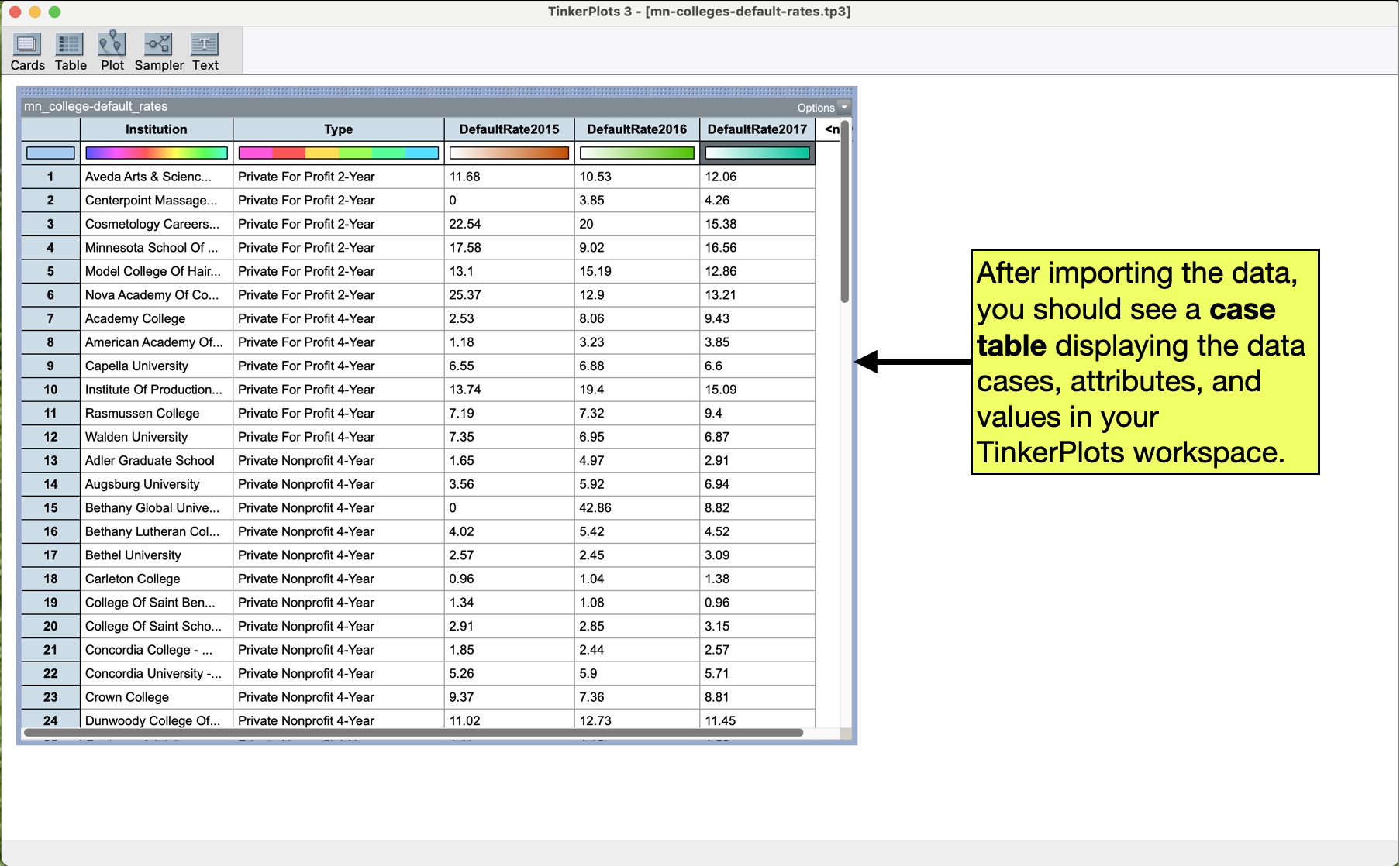
After importing the data, you should see a case table of the imported data in your TinkerPlots workspace.
Creating a Dot Plot
A dot plot is a simple data visualization that consists of plotting each case’s data value as a dot on a graph. To create a dot plot using TinkerPlots, we will:
- Click on the
Ploticon in the main toolbar and drag a plot into the TinkerPlots workspace. - Click on the name of the attribute in the case-table we want to plot, and drag that to to the x-axis of the plot. (When you do that, and get to the right place in the plot, you should see a rectangle appear along the x-axis).
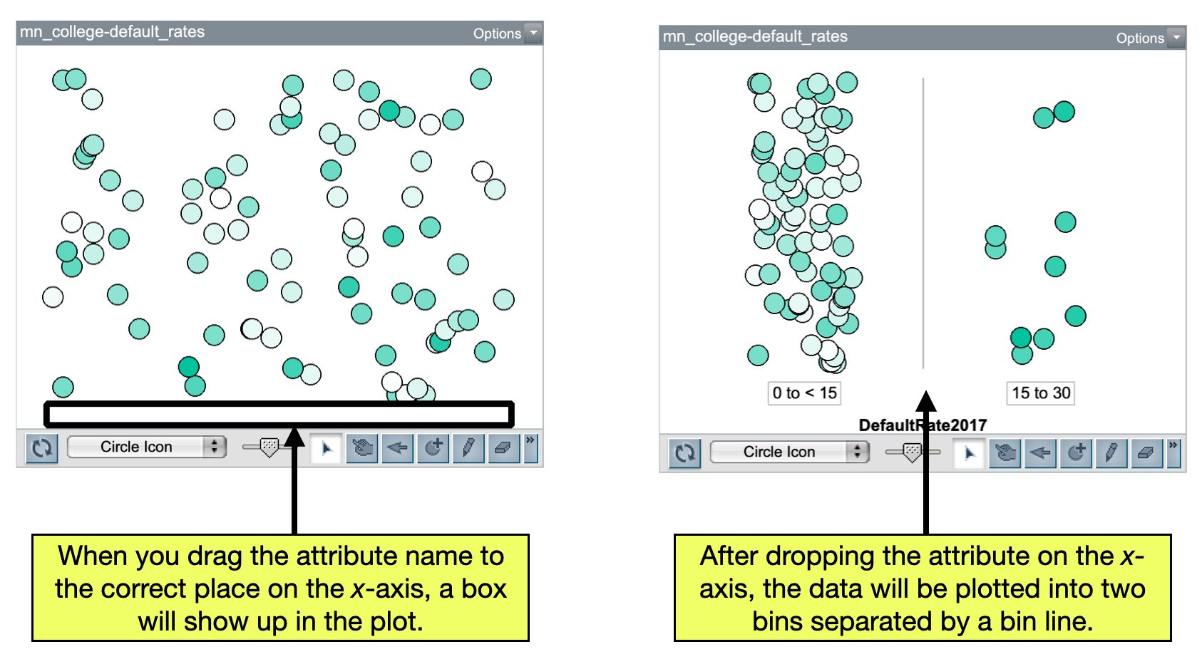
This should create a semi-organized plot of the data. One thing you will notice is that the data is binned. That is, there is at least one vertical line splitting up the data values into different categories (if you are plotting a categorical attribute) or ranges (if you are plotting a quantitative attribute). Every time we plot data in TinkerPlots, we want to be sure that the data in the plot is fully separated. This means that for categorical data, we want each category in its own bin, and for quantitative data we want no bins. To fully seperate the data in a plot,
- Click on a dot in the plot and keep dragging it to the right. You can let go when each category is in a unique bin (if you have categorical data) or all the bin lines disappear (quantitative data).
Another thing you will notice is that the dots representing the data are “floating” in the middle (vertically) of the plot. This makes it hard to compare counts of different values. To fix this problem, we will vertically stack the dots. To do this:
- Click the
Stackicon in the plot toolbar associated with vertical dots. (It has three vertically stacked dots on it.)
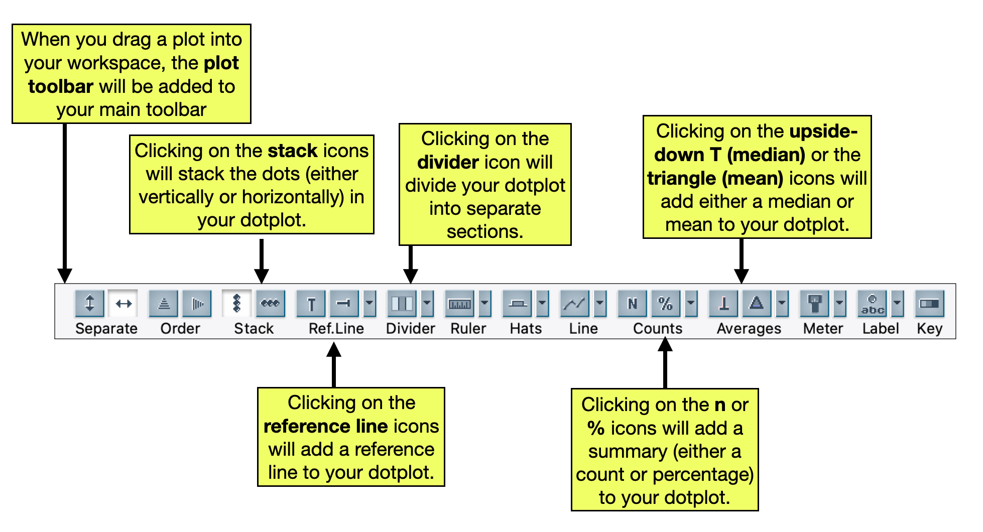
PROTIP
If you don’t see the plot toolbar, click on the plot to highlight it. That should bring up the plot toolbar.
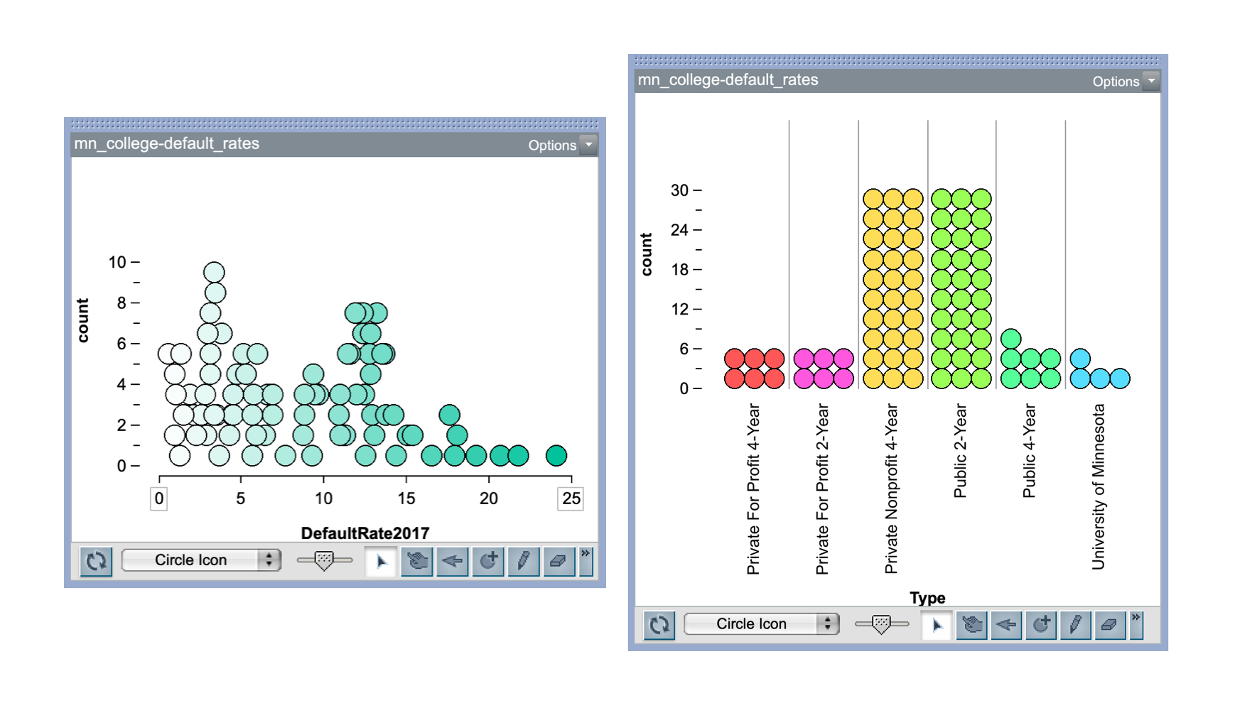
Now you should have a fully separated, vertically stacked dot plot.
Changing the Limits on the x-Axis
When TinkerPlots creates a dotplot of a quantitative attribute, it picks the minimum and maximum value displayed on the axis based on the data values. Sometimes it is necessary to change these. To do this:
- Double-click the box enclosing either the minimum or maximum axis value. You can then indicate the value you want the axis to end at.
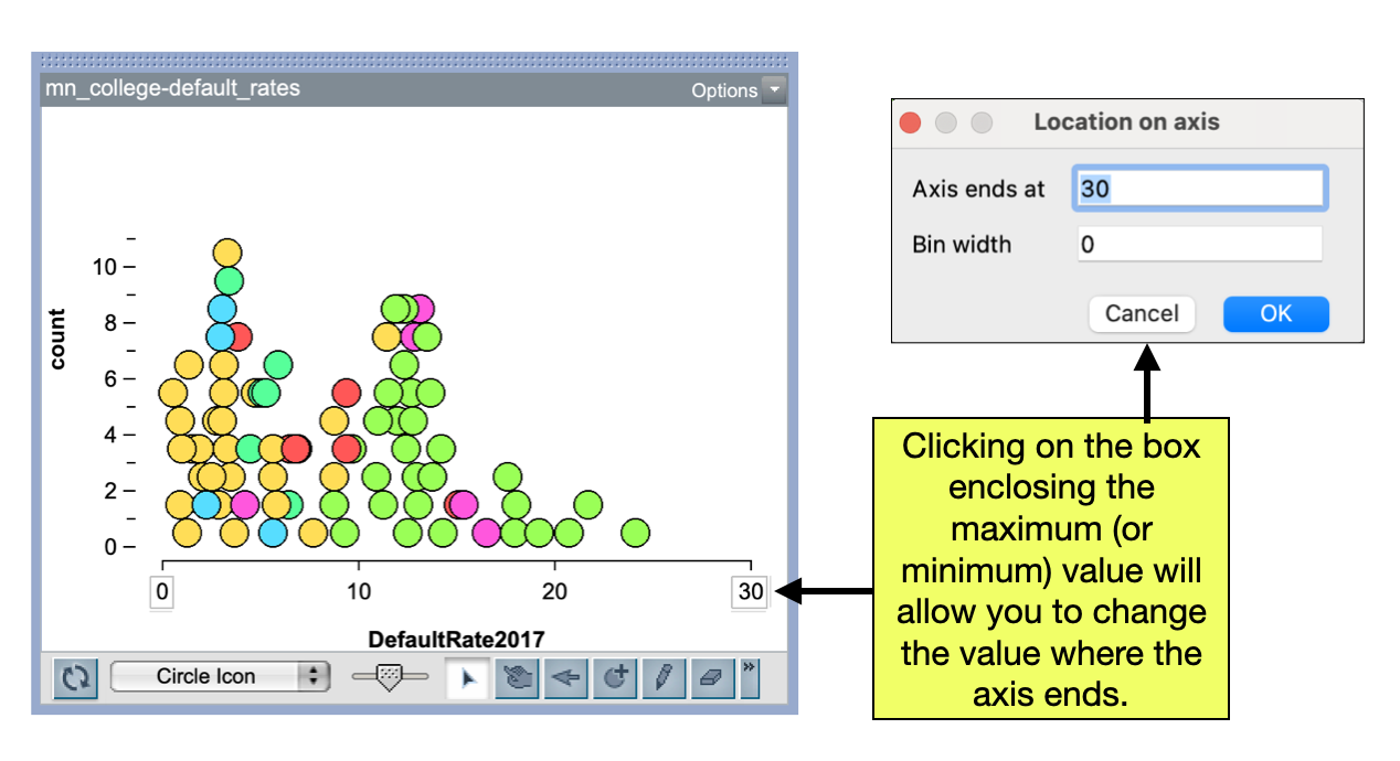
PROTIP
You can also change the bin width by double-clicking on eithere the minimum or maximum axis value. this. A fully seperated plot should have the bin width set to 0. This is an alternative method to fully seperate the cases in a plot.
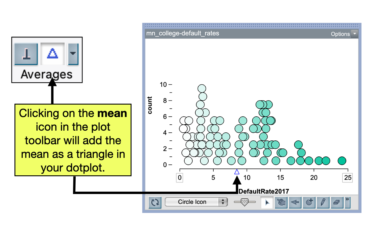
Adding Summaries to the Plot
A fully separated and stacked plot of the data is useful for describing the data’s distribution. Another thing that is useful is to compute numerical summaries. For categorical data, we typically want to compute the count (or percent) of cases in each category, and for quantitative data it it typical to compute the mean (or median) of the values. To compute summaries:
- Make sure the plot is highlighted so that you have access to the plot toolbar.
- Click on the summary icon in the plot toolbar that you want to display on the plot.
For example, to add the mean to our previously created plot we would select the Mean icon from the plot toolbar.
If you summarize the mean or median, you will also likely want to see what the numerical value of that summary is. To do that:
- Click on the
Average Options(upside-down triangle next to the averages) and selectShow Numeric Value.
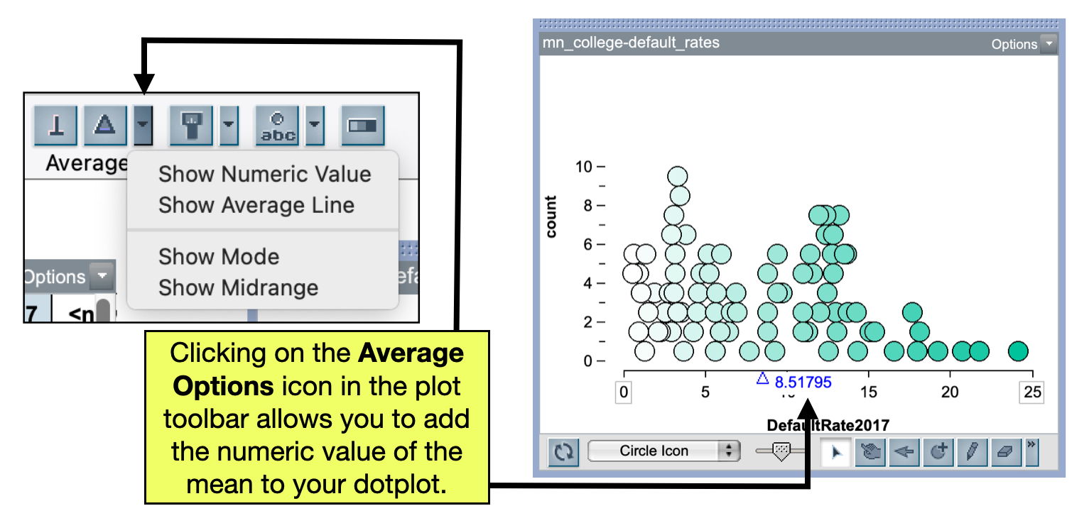
PROTIP
Any time you see and upside-down triangle in TinkerPlots, it is associated with additional options that you can select.
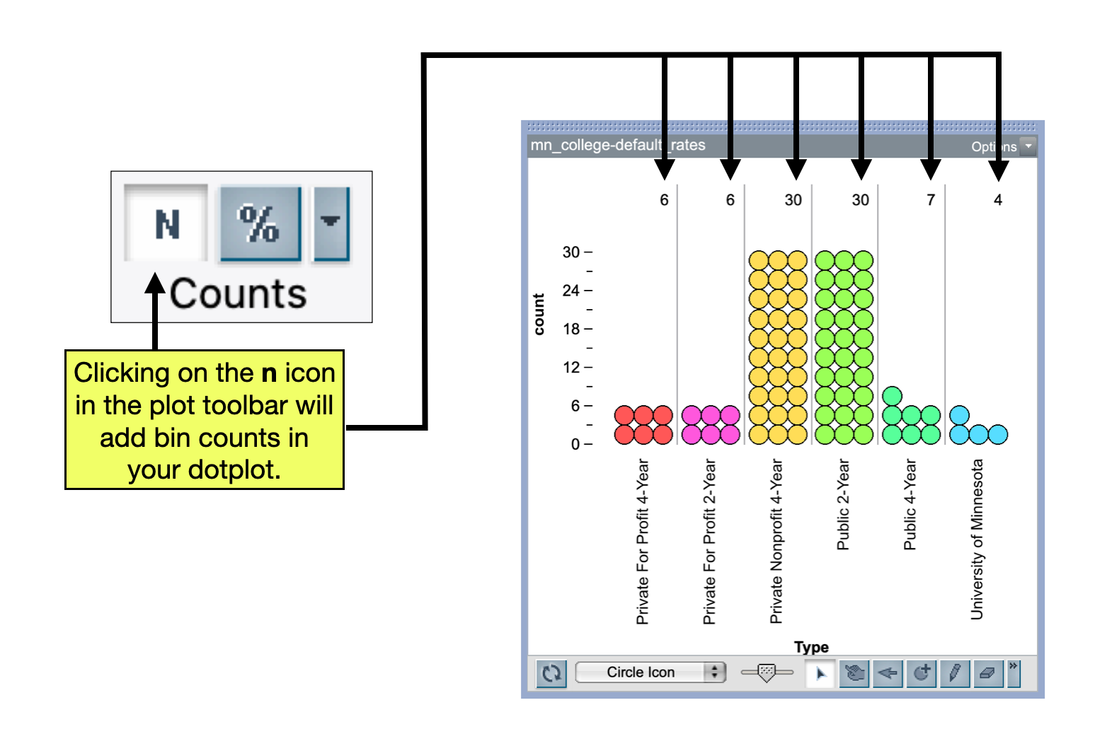
With categorical data, we summarize with counts and percentages. To do this, with the plot highlighted,
- Click on the n (counts) or % icon in the plot toolbar that you want to display on the plot.
Adding a Divider to the Plot
Sometimes it is useful to divide you plot into different parts. To do this we highlight the plot, and:
- Click on the Divider icon in the plot toolbar.
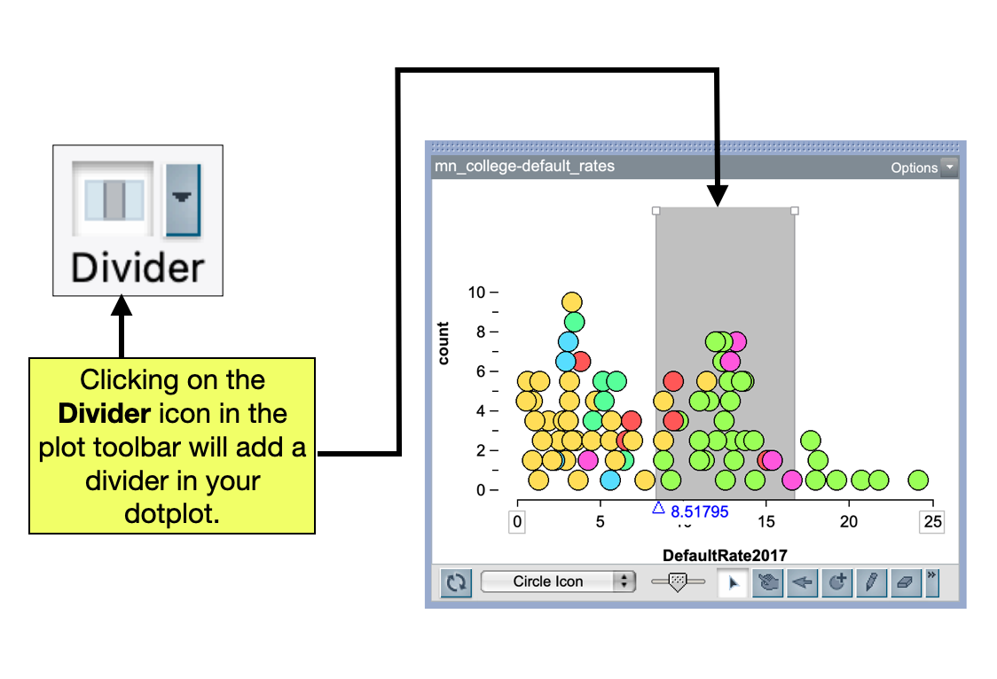
By default, the plot will be divided into three distinct parts: a shaded middle part and two unshaded ends. You can change where the division is by dragging the ends of the shaded area. To do this:
- Click on the white boxes at the top of the divider in the plot and drag the end to where you want it.
- You can also double-click on the white boxes at the top of the divider and enter in a specific value you want the divider at.
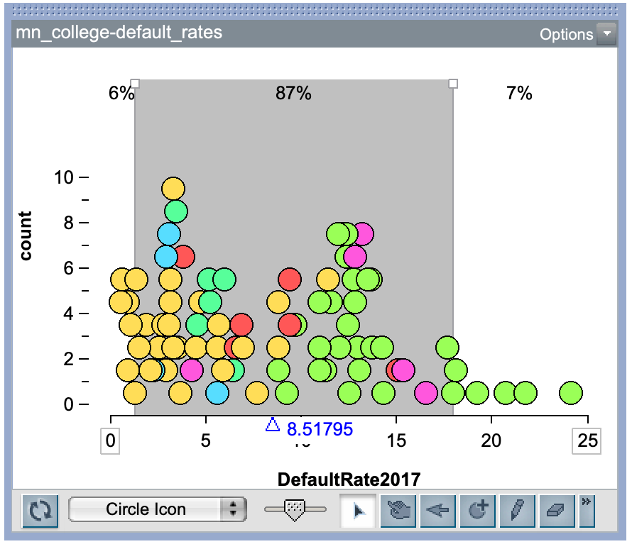
It can also be useful to add counts or percentages to the plot after you have added a divider. This will tell you the number or percentage of cases in each of the three sections. To do this, highlight the plot, and click on the n or % in the plot toolbar.
Adding a Reference Line to the Plot
A vertical reference line can be added to the plot by clicking on the vertical reference line icon in the plot toolbar. This is useful when you want to indicate a particular value on your plot.
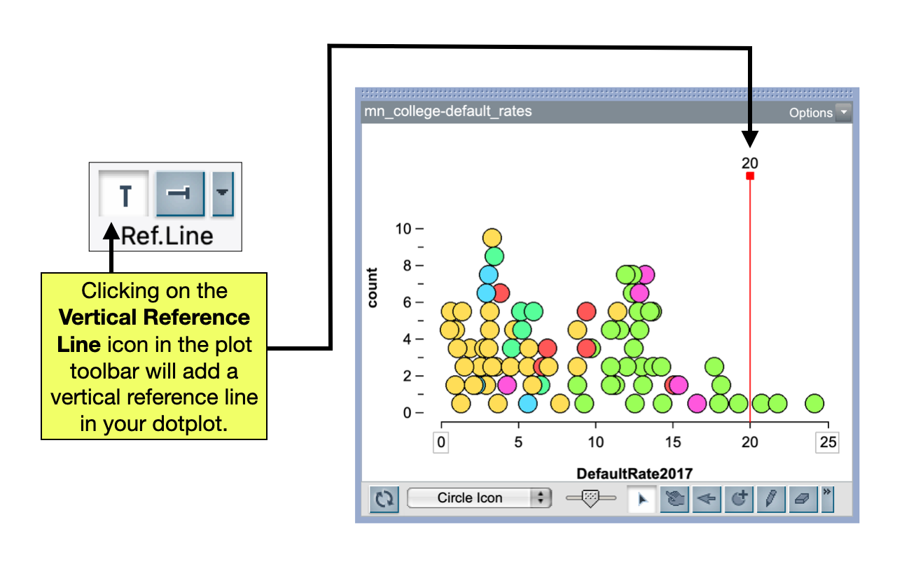
You can move the vertical reference line by:
- Clicking on the red box at the top of the reference line (in the plot) and dragging the line to wherever you want it.
- You can also double-click on the red box at the top of the reference line and enter in a specific value you want the reference line at.